Hello everyone, I’m Olivia, the Ragged Life workshop tutor for the York area. This blog post is a little different from normal as its written by myself rather than Elspeth… We wanted to share a new perspective on the enjoyment and creativity that comes with rag rugging, so here I am 😊.
I’m originally from Barnsley in South Yorkshire, but moved to York almost three years ago to study. York is such a beautiful historical city and I feel very lucky to live here. I’m now in my final year (thankfully!) at the University of York studying sociology and criminology and, although I’ve enjoyed my three years of this subject very much, it just doesn’t excite me in the same way as being creative and making things with my hands does. Before starting university, I was trained and worked as a florist which is something I’m very passionate about and have decided to pursue (although in a different way) after university. I currently work part-time at Ragged Life, which is great as rag rugging makes just as fun a job as it does a hobby!
Making rag rugs has been a great outlet for my creativity, which makes me a much happier person. Sometimes I find that I’m so focussed on a piece that hours will go by and I haven’t realised it (I’m sure some of you can identify). It also enables me to calm myself when I’m under a lot of stress with looming deadlines. But, aside from having a therapeutic effect, I find rag rugging is a really simple and inexpensive hobby to have. Everyone knows that most students don’t have money sloshing around so getting materials cheap in a charity shop or having them donated for free is really useful, plus you are recycling which feels great. A few times I’ve found myself rummaging through my wardrobe (and other people’s, rather cheekily) to find some hidden gems that don’t get worn. It’s also really easy to put a design down and go back to where you left off whenever you choose. Rag rugging is one of the best hobbies I’ve ever had and a mega upside of it compared to floristry is that it’s nowhere near as messy! You’re very unlikely to get covered in mud or have frogs jump out on you for example. Yes, that really has happened!
Because of my background in floral design, Elspeth found that I was good at choosing and placing the right materials into a design so she thought that it would be an interesting experiment for me to explain how I do this, using the skills I learnt in floristry.
When I first started my floristry training there were a few basic rules I was taught to help me create the best-looking designs, all of which can easily be applied to rag rugging…
The 5 Elements of Floral Design:
The first of the rules of floristry are known as “The 5 Elements of Floral Design”. These are: Line, Colour, Form, Texture and Space. I’m not going to go into them all (as I don’t want to send you to sleep), but I will go over the ones I think are most useful when it comes to designing rag rugs.
Colour:
In my opinion, colour is the most important aspect of a design, it’s what catches your eye and can make or break a piece. This is why in florist training, the first thing you learn is colour theory! There are many different ways to match colours but to learn them you need to have an idea of the colour wheel. When I first learnt this at college, I couldn’t get my head around it (as it can get quite complicated), but the more you try new things out, the more you begin to pick up what goes together… and what inevitably doesn’t.
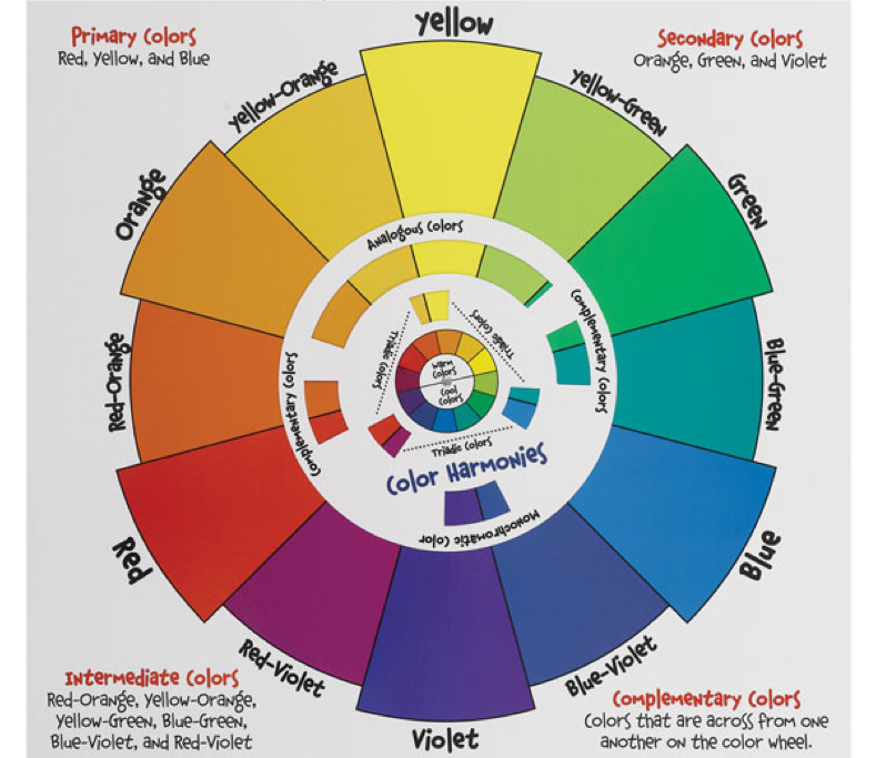
The Colour Wheel
The colour wheel helps you to figure out colour schemes that will work in harmony with each another. Here are a few examples of different colour schemes using the colour wheel. Don’t get too hung up on this part though, sometimes it is best to go with your gut instinct on what looks best.
Analogous – These harmonies are 3 or 4 colours that sit next to one another on the colour wheel.
In this heart design, the colours red, red/orange, red/violet and violet feature prominently. The violet in this piece really stands out and works beautifully in contrast with the other remaining warm colours. I also love the subtle scatter of gypsophelia throughout this design, similar to how a white lace might be used in a rag rug.
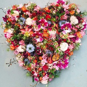
Credit:@masterflorists.
Monochromatic – These harmonies are a single colour on the wheel in varying shades, lighter or darker.
This design is made of the colour orange in varying shades. There is also a hint of pink in there (a shade of red on the colour wheel) which I think works really well with the orange tones. My favourite flower in this design is the ranunculus, it’s one of my favourite flowers and its peachy colour is so pretty!
Credit: @solemoonstudio.
Triadic – These harmonies are ones that form an equal triangle on the wheel. For example, the primary colours: red, blue and yellow.
This triadic colour scheme uses yellow/orange, green and red/violet. Using four different flowers, the florist has managed to create a large and vibrant vase arrangement that is really striking. The purple hydrangea really contrasts with the orange carnations.
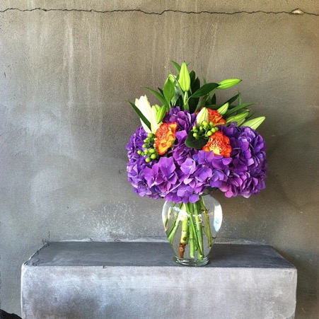
Credit: @jasminesgarden
Complementary – These harmonies are colours that sit opposite each other on the colour wheel.
This design uses the complementary colour scheme of red and green. This would be ideal for a Christmas centrepiece. I especially like the way the red in the middle of the green cymbidium orchids match perfectly with the red roses and red dendrobium orchids.
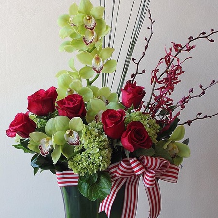
Credit:@cdmflorist.
Texture:
Texture is also a very important part of floral design and I think it’s safe to say that this is the same for designing rag rugs too. To create an eye-catching and attractive piece, I think it’s important to include a variety of textures in your design, from heavier fabrics like fleece to lighter ones like lace or chiffon. Using different kinds of fabrics not only gives your design some depth but will also make it feel amazing!
There are so many different textures in this beautiful bridal bouquet. My favourite texture in this is the brunia. It is unique with its hard and bobbly texture and it contrasts so well with the other softer textures.
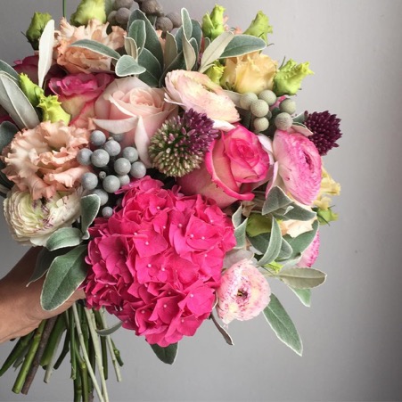
@theflowerjam
7 Principles of Floral Design:
Once you get the core ‘elements’ in place we can then start to think about the placement of our flowers (or materials in the case of rag rugging). For a guide on this we can look to the ‘7 Principles of Floral Design’. These are: Balance, Dominance, Contrast, Rhythm, Proportion, Scale and Harmony. Although to relate more to rag rugging, I’m going to focus on three of these principles: balance, rhythm and contrast.
Balance:
For a design to look its best you need a good balance of both colour and texture. You don’t want too much of the same texture or colour of fabrics because it may end up looking quite plain. You also need to make sure the amount of similar colours and textures are spread out equally throughout the design for it to be balanced as a whole piece.
This piece is beautifully balanced, the colours and textures are placed evenly. Along with an analogous colour scheme of red/orange, red, red/violet and violet, it is perfectly synchronised, each flower perfectly complements the other. The balance of colour, texture and placement of the flowers mean this piece is one of my favourite designs featured in this post.
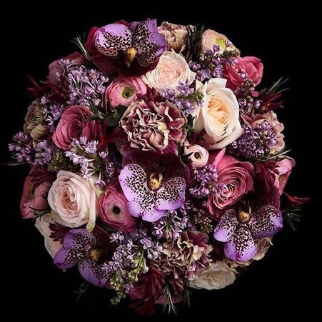
Credit:@masterflorists.
Rhythm:
For the textures and colours in your design to work together you need rhythm. This basically means the textures and colours should draw your eyes through the design by placing similar materials equally throughout the whole piece.
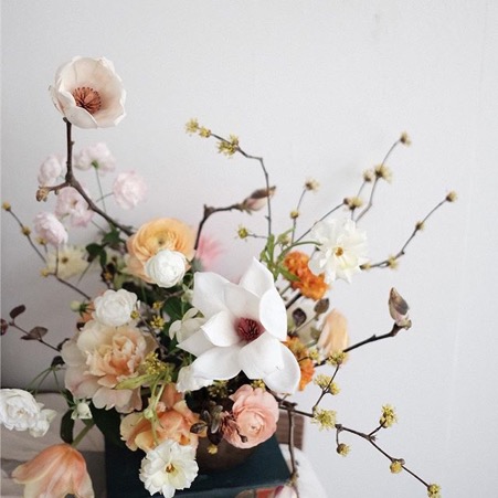
In this design willow branches have been used to draw the eye along the piece to give it rhythm. The dominant flowers are also kept in the centre (in this case the pink roses and protea) and the lighter flowers flow from one edge of the design to the other. I love the protea and the yellow craspedia in this, it make it feel a little more exotic in contrast with the rest of the more traditional flowers.
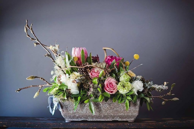
Credit:@tailoredtwig
Contrast:
For your design to really pop it’s good to get a contrast of colours and texture. For example, if you’re working with one colour in varying shades, it’s good to also include one really light colour (maybe even white) that will lift your design and make it look more eye catching.
In this bouquet the peach peonies really contrast with the rest of the colour palette, and especially complements the blue berries. I also like the way they have contrasted bold round-headed flowers with other textures such as the spikey thistle and the light eucalyptus foliage.
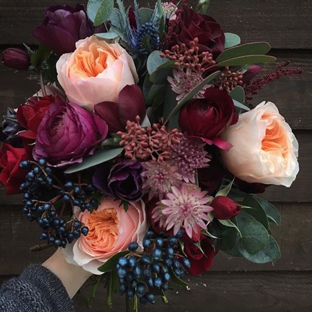
Credit:@fairynuffflowers
Conclusion:
So, I hope you all found that an interesting introduction to the rules of floristry. To finish, here’s one of my own recent arrangements I entered in the summer village show where I live in York.
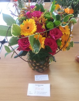
Flowers in a pineapple
The category was ‘arrangement in a usual container’. I like vibrant and colourful designs, which looks a bit quirky, so I decided to make mine in a pineapple. I used lots of different textures from the soft, vibrant roses to the furry kangaroo’s paw and I also made sure the placement of flowers made it look visually balanced, which added with the looped foliage, gave my design some rhythm. Here’s me with my arrangement looking all happy because I placed first!
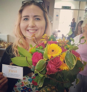
Me looking all chuffed with my first place flower display!
Overall, my advice is: don’t get too hung up on being precise with the elements and principles, sometimes it’s best to go with your gut. Plus, people have different tastes so what someone else likes, you may not and vice versa. Either way, I’ve found these tips can sometimes come in handy and help you as a guide when designing, whether it be creating floral arrangements or making your own rag rug. Just ask yourself, what colours and textures am I using? How do they work to complement or contrast each other? Will they work in harmony as a whole? How should I place them in my design to make sure it looks balanced? And, how can I place materials to make sure the eye is drawn all the way through my design? If you can answer all these questions, then you should end up with a beautifully designed piece of work.
Stay tuned to see how I incorporate these learnings into my rag rug pieces over the coming months…
Olivia x
p.s. Enjoyed this post? Stay tuned with my progress by joining the Ragged Life invite-only rag rug community on Facebook where I will be posting some work-in-progress photos of my journey 🙂
Found this very interesting and put clearly. Thank you Olivia
So glad that you found the post interesting Barbara. Hope it helps when you’re designing your next project 🙂