The Summer Exhibition at the Royal Academy of Arts in London has become one of the events that I most look forward to every year. It is one of the largest open-submission art shows in the world, which means that anyone, even you or me, could submit a painting or piece of art. In fact, when I finally get around to it, I’m definitely going to submit a piece and see what happens. As an open-submission exhibition, the Summer Exhibition always has a completely eclectic mix of art and it’s this higgledipiggledy mix up of art in every style and size under the sun that I love so much. That and the sheer quantity of art they cram onto one wall, so there’s something for everyone at every turn. I’m always on the look out for rag rug inspiration.
This year, the illustrious Grayson Perry was curating the main gallery of the exhibition (Gallery III). I like a lot of Perry’s art (in particular his pottery), so I was intrigued to see how it turned out. Below are a few photos from the day and some of my highlights. I hope you find it interesting 🙂
The Wohl Central Hall:
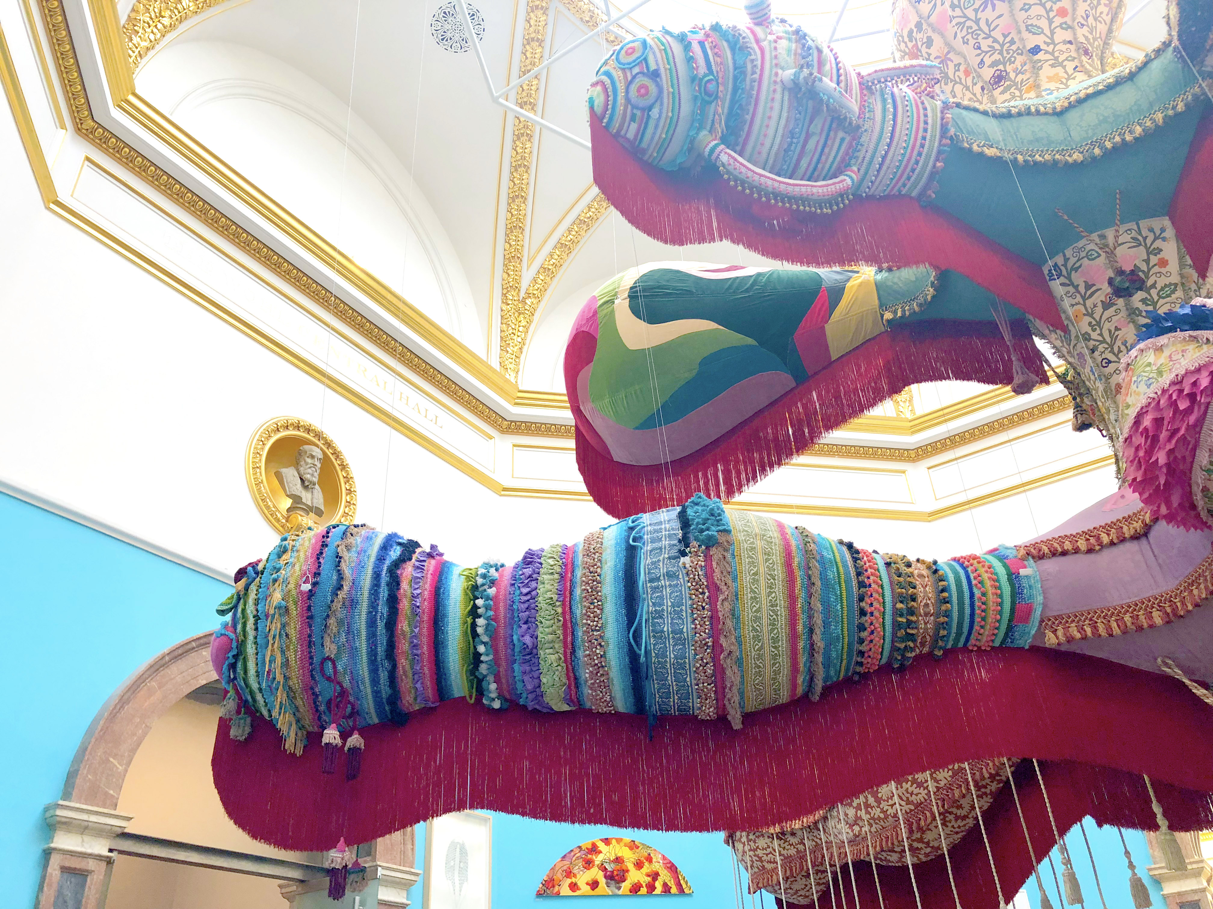
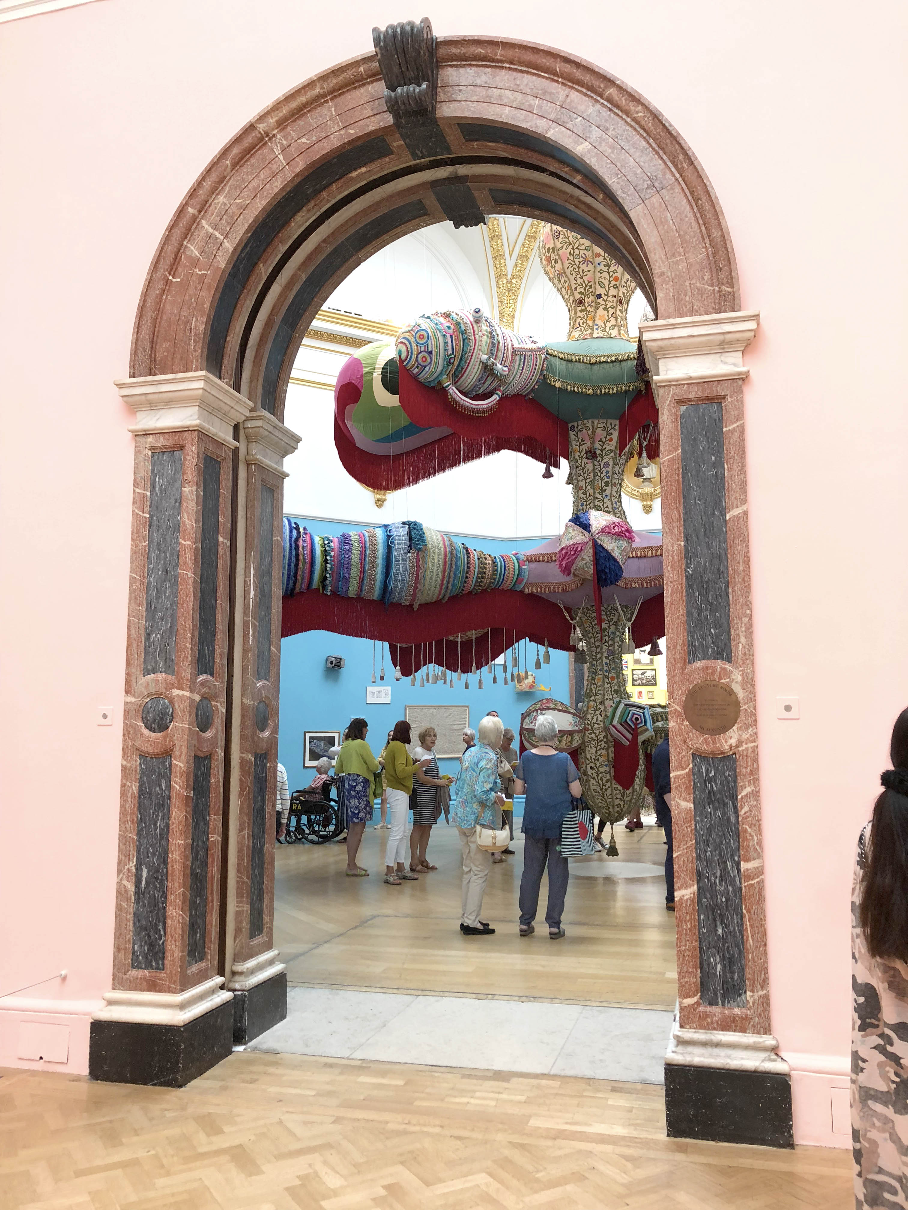
The Royal Academy Summer Exhibition 2018 started off with a bang with a giant textile mobile hanging in the first room. It’s pretty hard to capture the scale and impact of this piece by Joana Vasconcelos but here are a few awkward photos that I did manage to get:
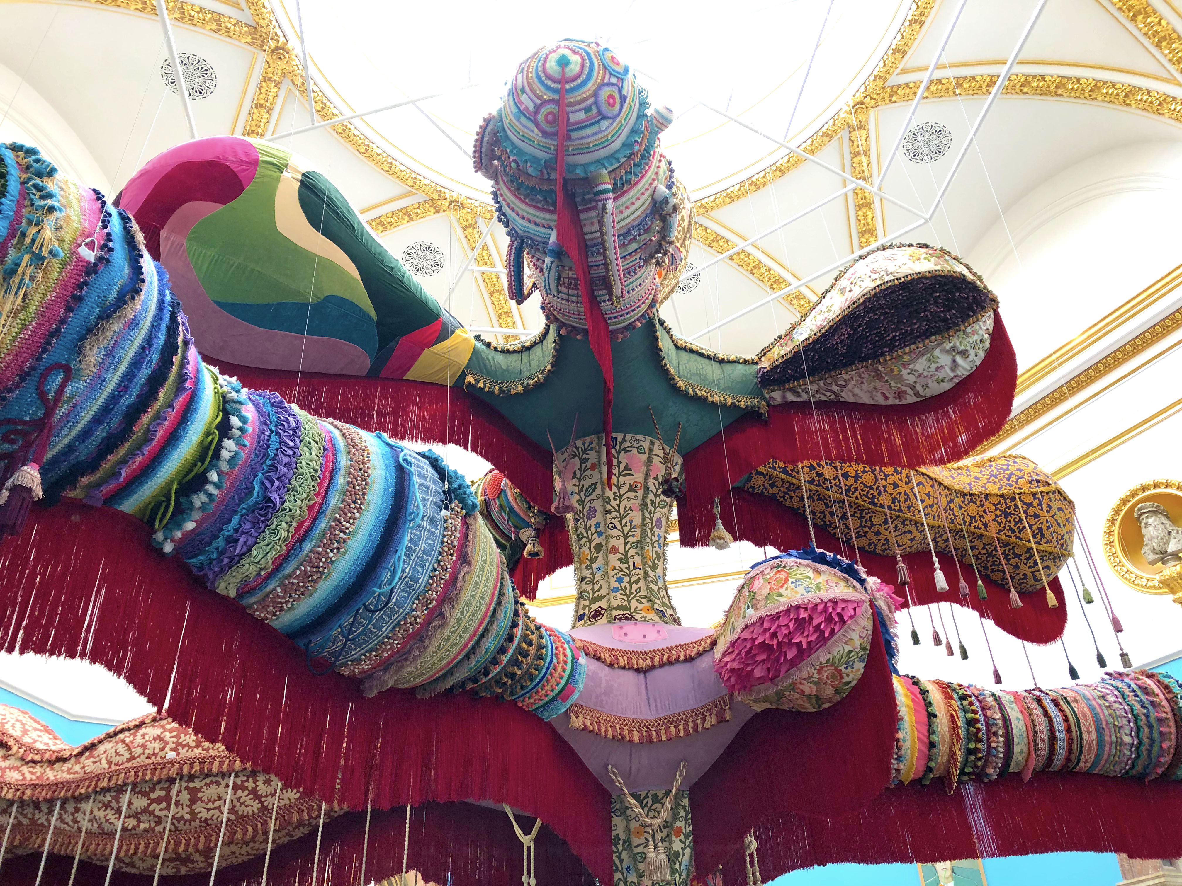
I really wasn’t sure what to make of this “Royal Valkyrie” artwork by Joana Vasconcelos. It was certainly striking and it’s nice to see crochet taking centre stage.
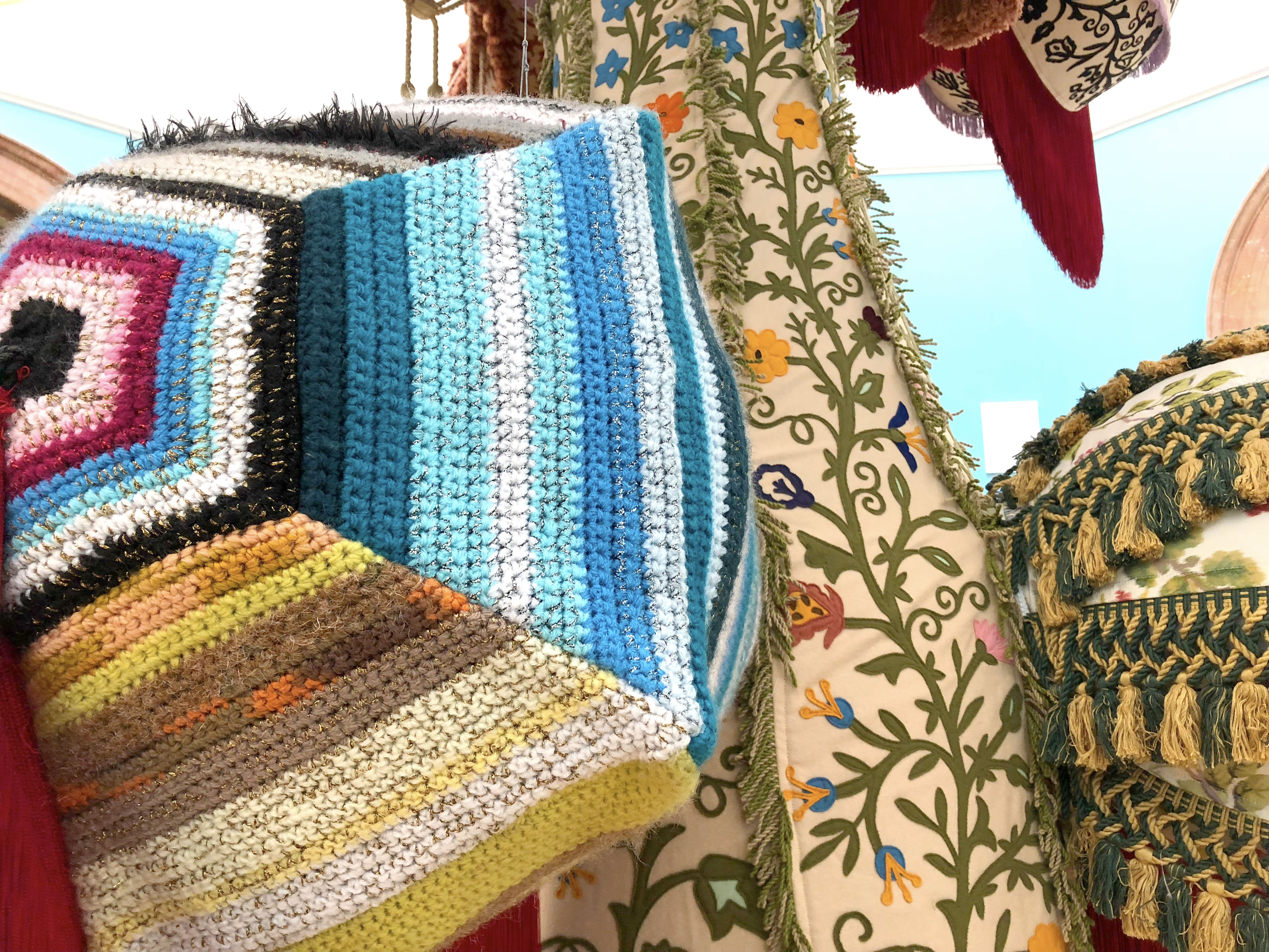
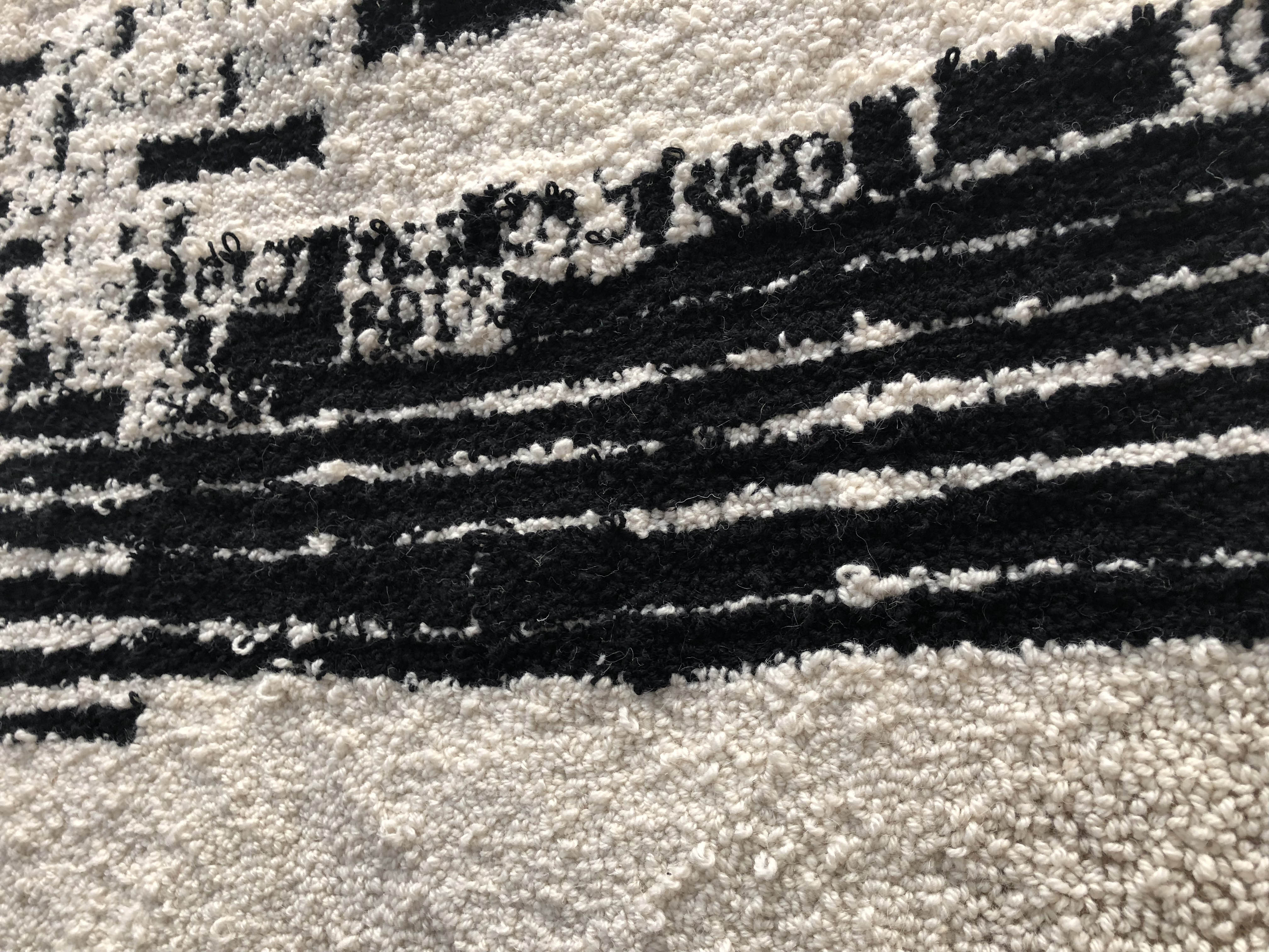
Here you can see some of the crochet up close.
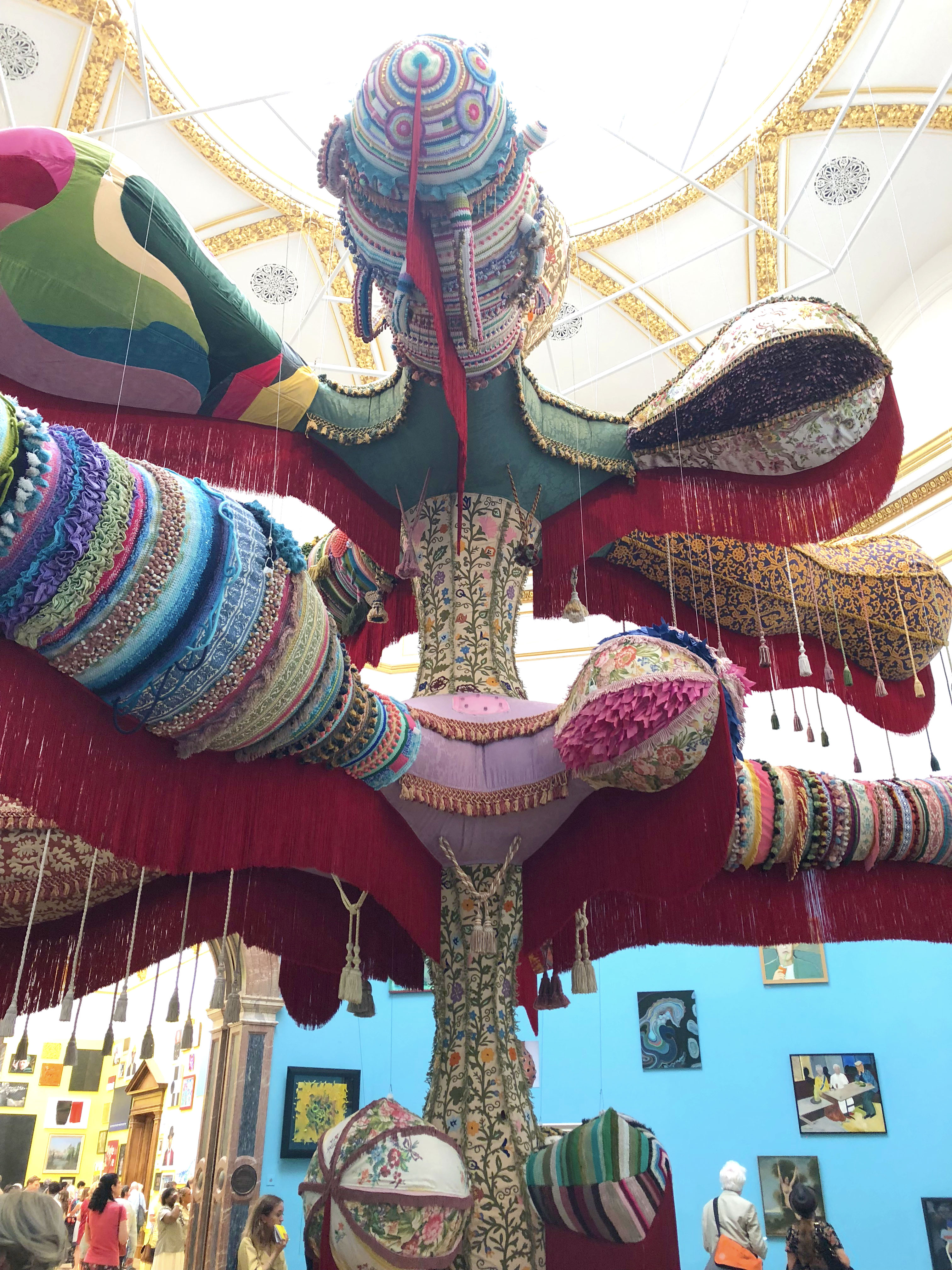
This imposing artwork almost filled the Wohl Central Hall of the Royal Academy Summer Exhibition 2018.
I liked this “arm” best (is that what you call it?) as it has lots of different textures.
The first room was painted blue, which I thought set off the paintings particularly well. The Wohl Central Hall had some of my favourite artworks from the entire exhibition displayed.

I’ll start with my favourite piece from the room (and possibly the whole exhibition). I loved this bright and beautiful piece “In Between the Islands” by Jenny Wheatley, £4,800. It may be a bit out of my price range, but it was so happy.
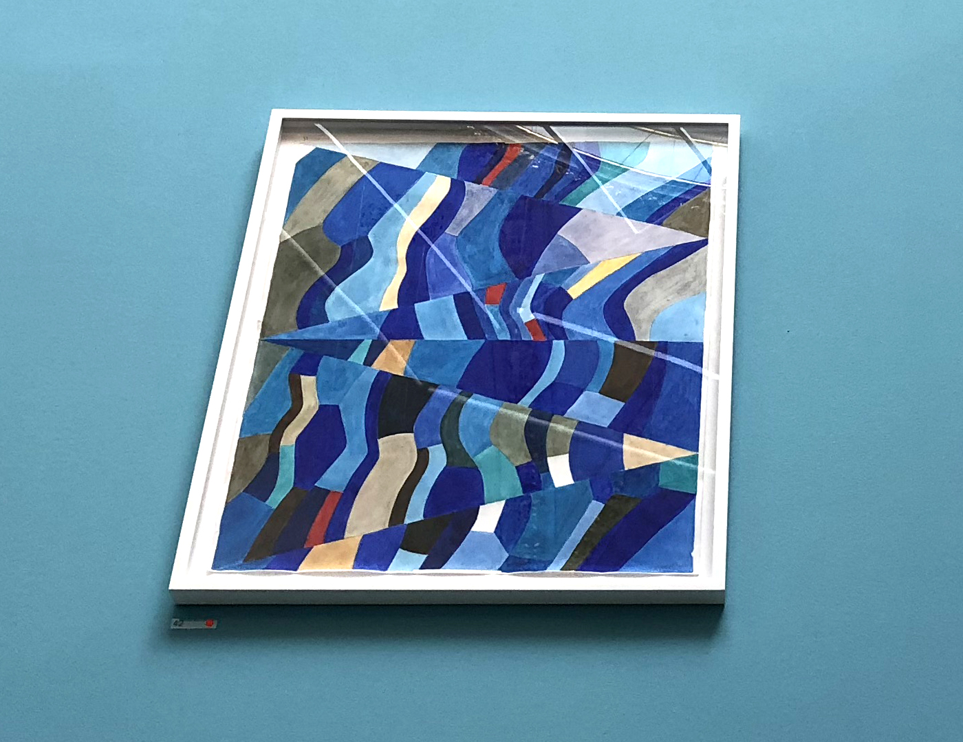
This artwork “Panel For Ascension” by John Maine, £2,250. It was pretty high up on the walls so was difficult to photograph, but I really liked the colours and geometric design.
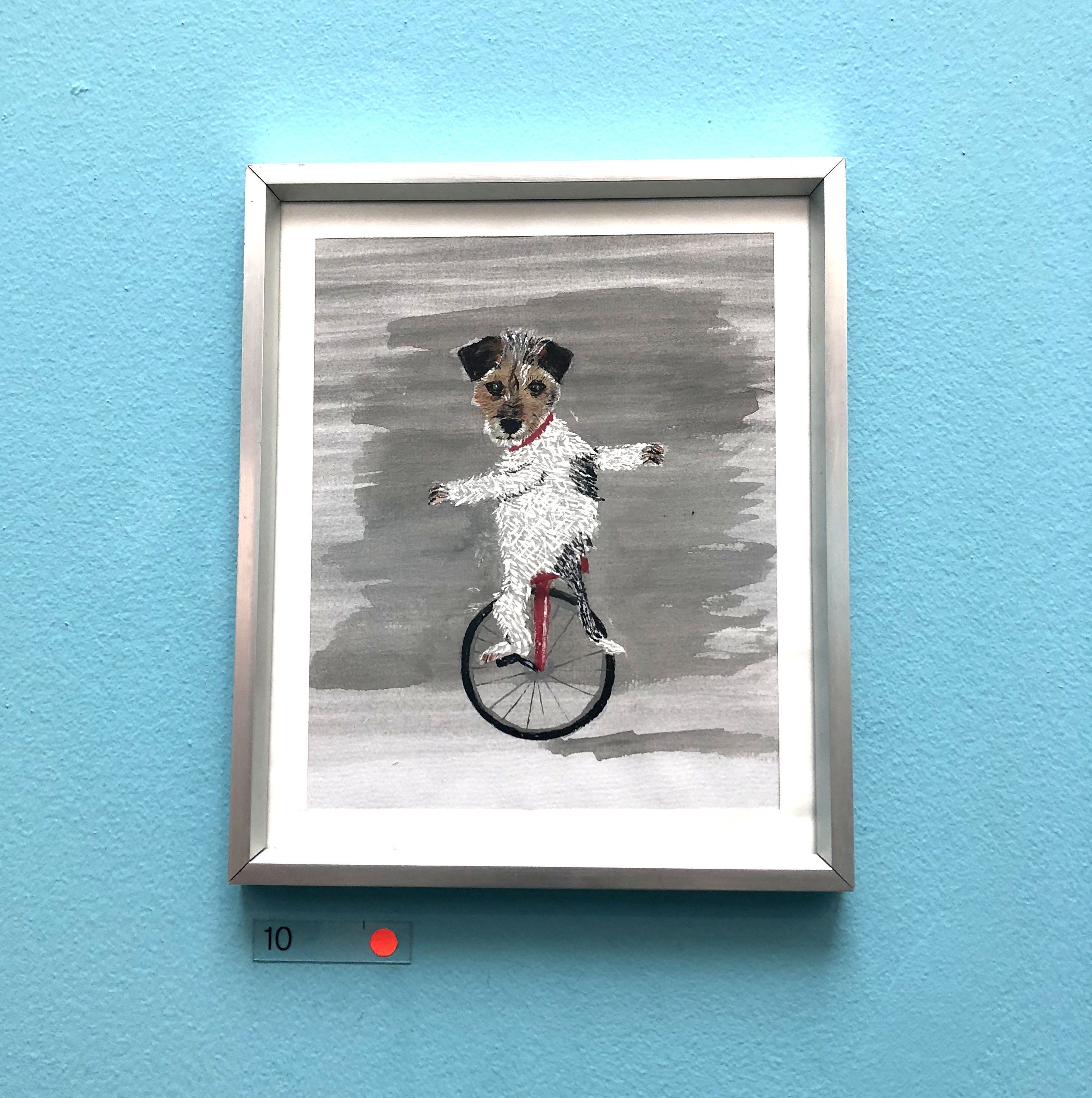
This year’s Summer Exhibition was particularly playful. I thought this dog on a unicycle was hilarious. “Peggy” by Les Deacon, £150.
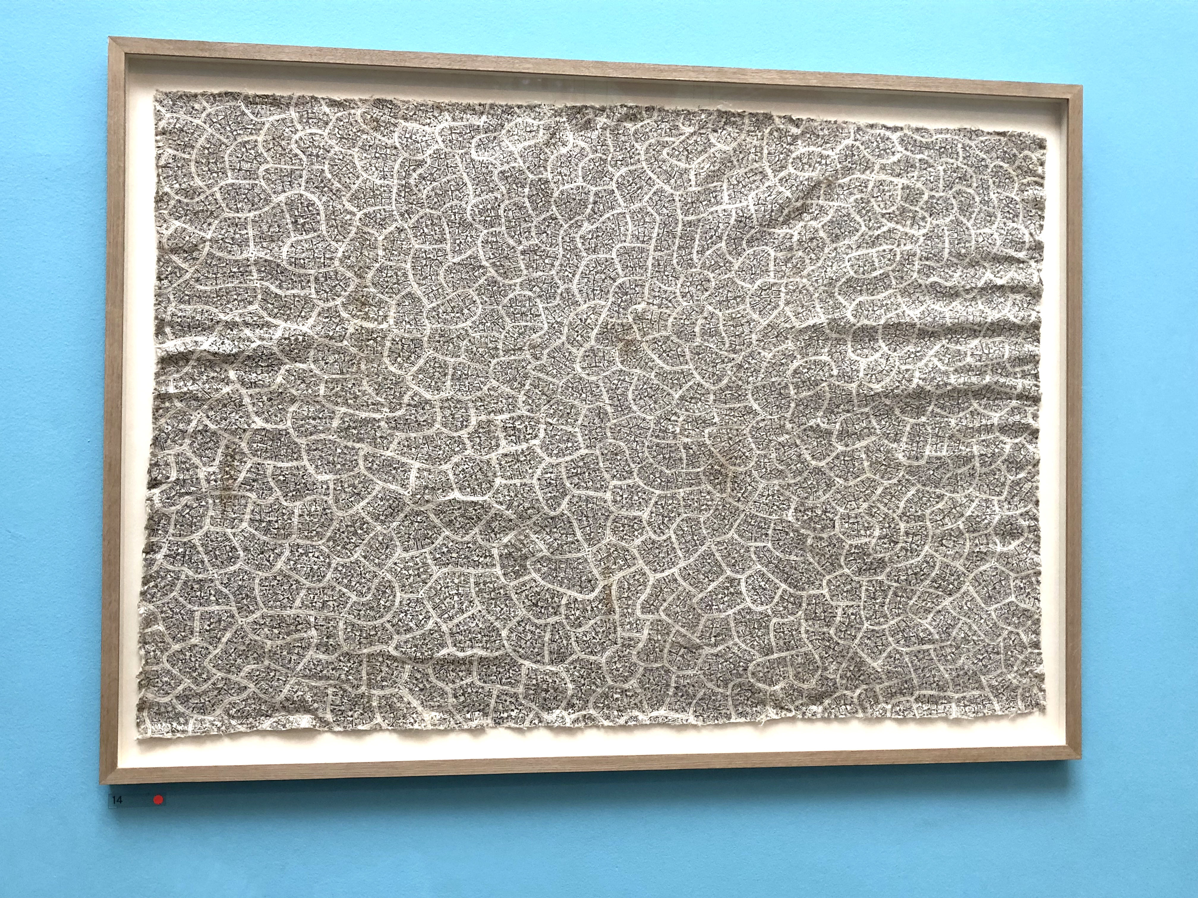
This artwork, “Tamaiti O Te Hutt” by Jennifer Summers, £3,800, doesn’t look like much from afar, but when you get up close, it’s a street map of cul de sacs. Completely random, I know, but it appealed to my curious mind.
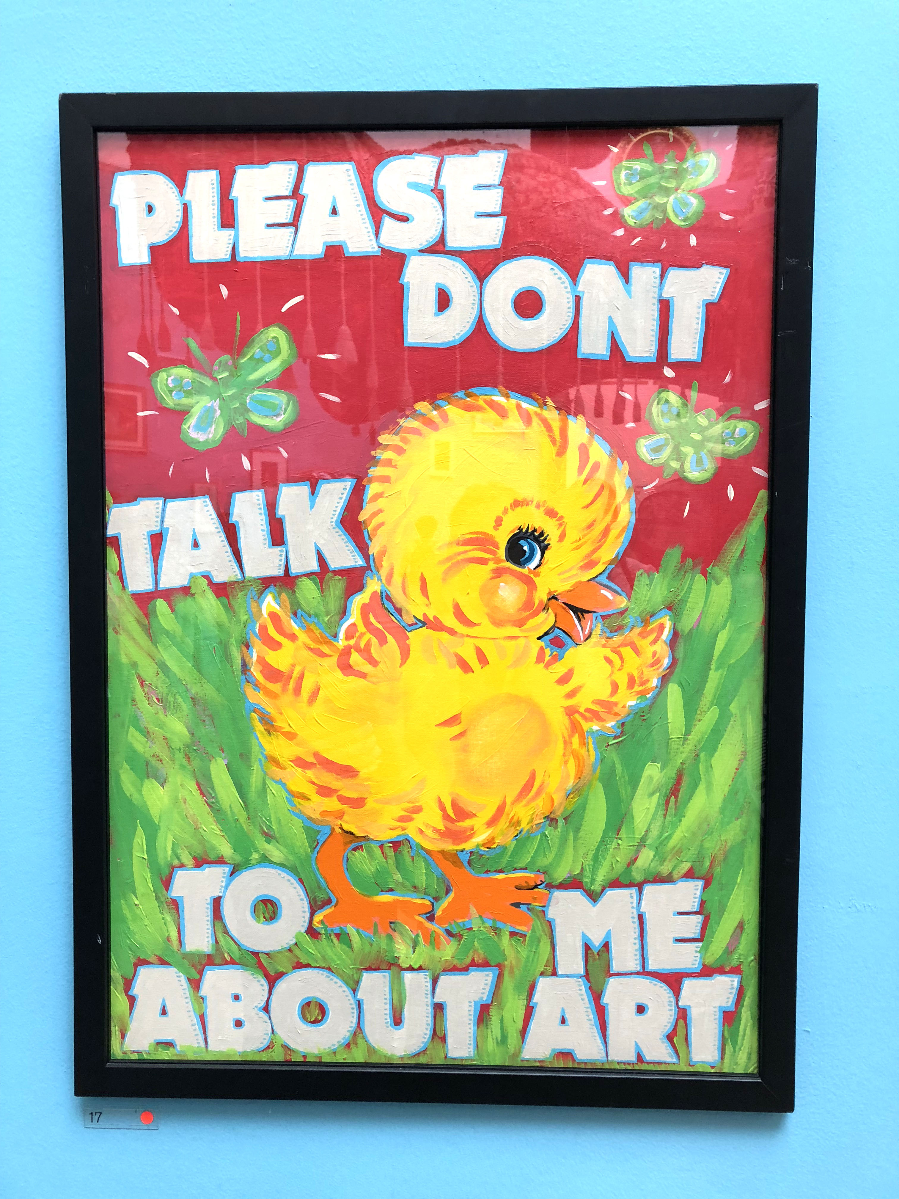
Hahaha, you’ll probably be feeling this way by the end of this blog post. This art, surprisingly, was called “Please Don’t Talk To Me About Art” by Magda Archer, £3,350.
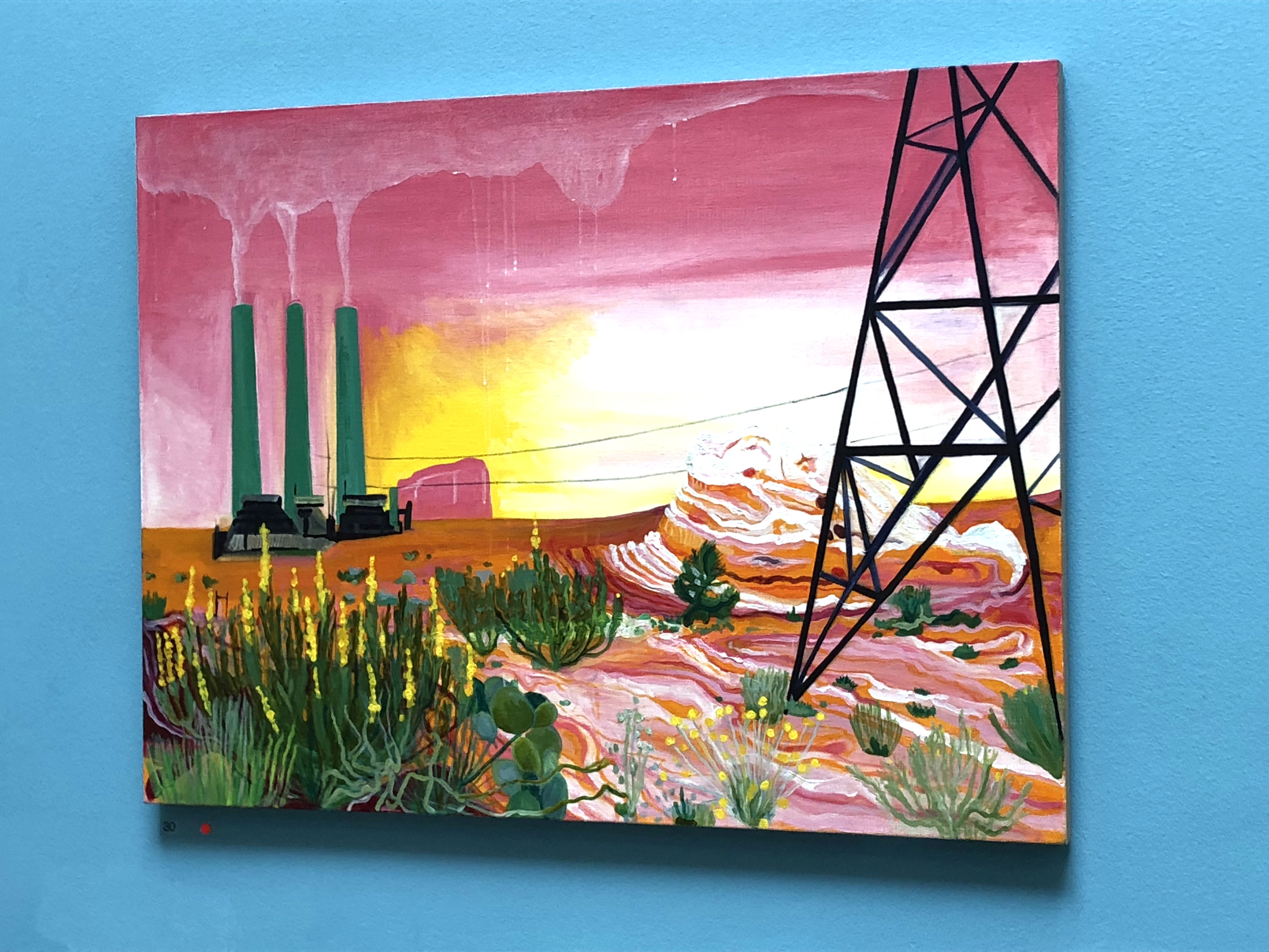
This maybe wasn’t the most aspirational of landscapes but the colours and composition were just dreamy. It’s called “We Could Use A Little Bit Of That Good Old Global Warming” by Lisa Rigg, £1,450. I suspect this may be ever so slightly satirical.
Gallery III:
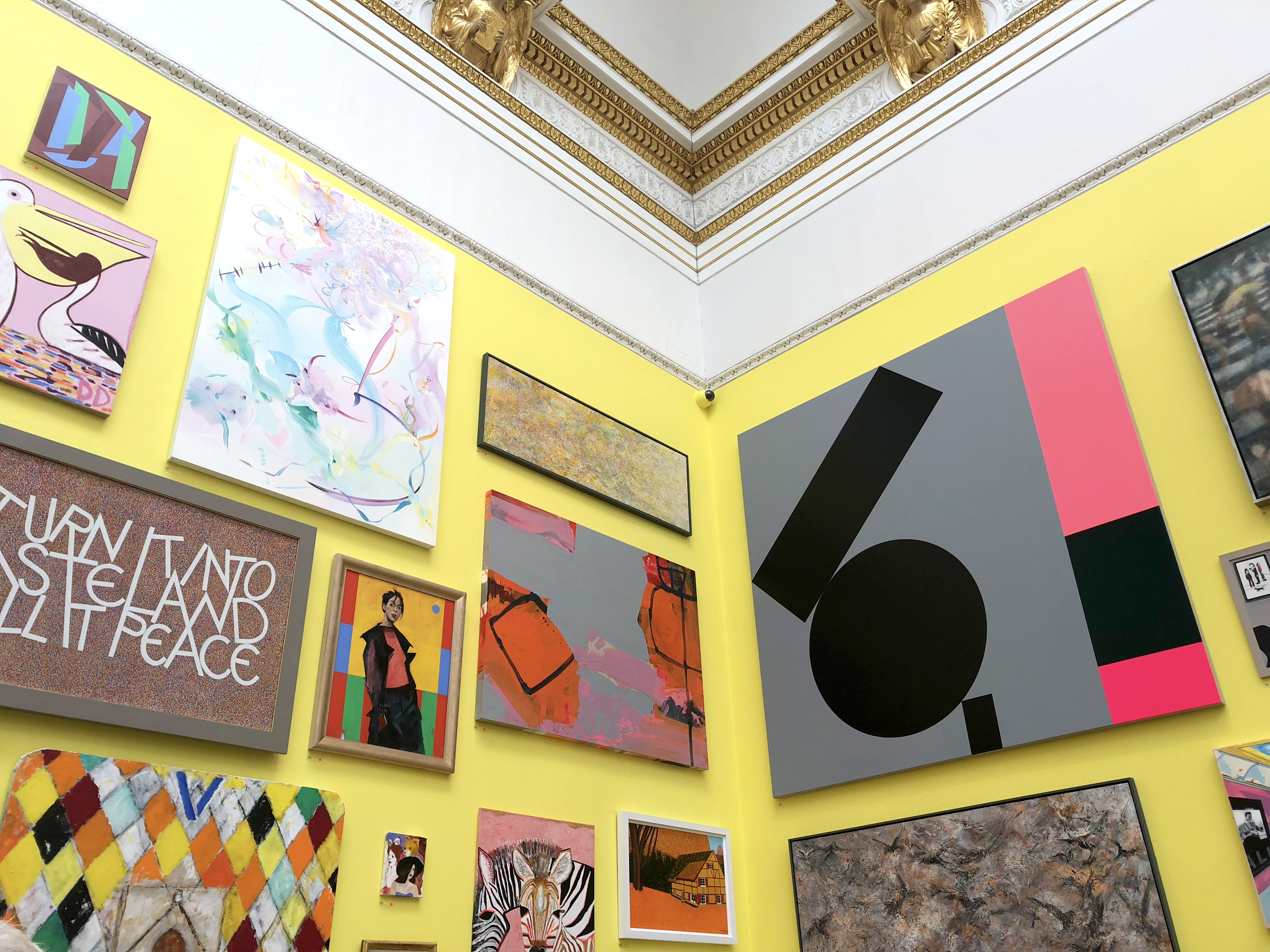
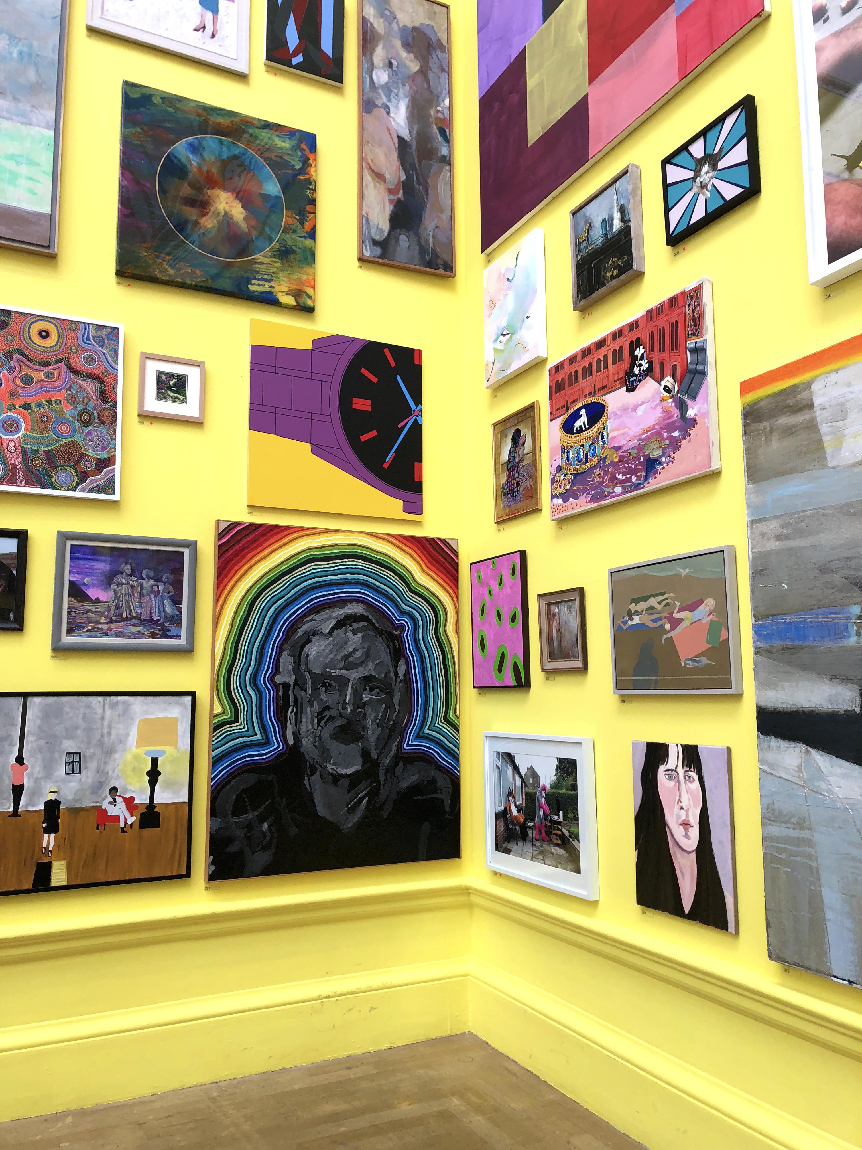
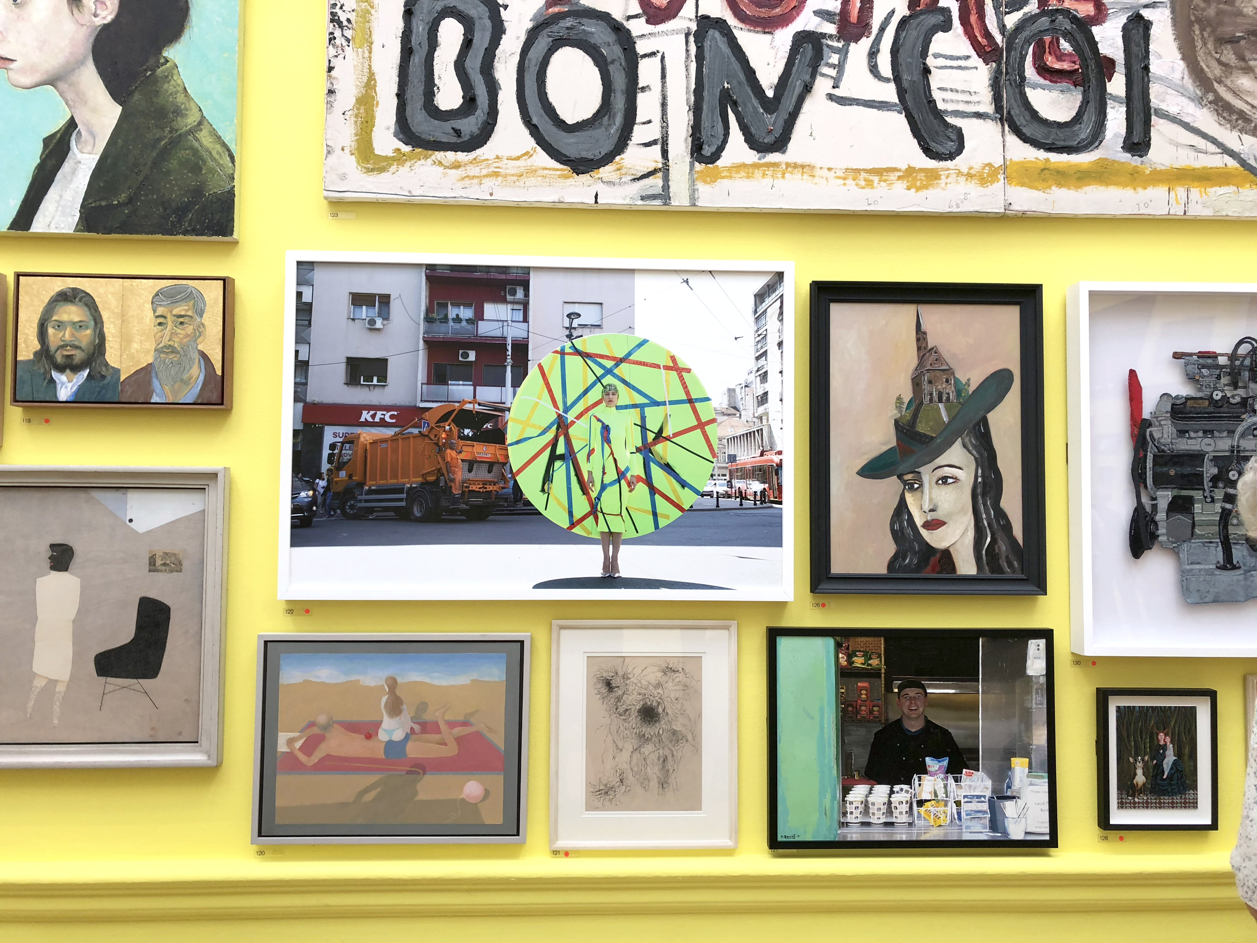
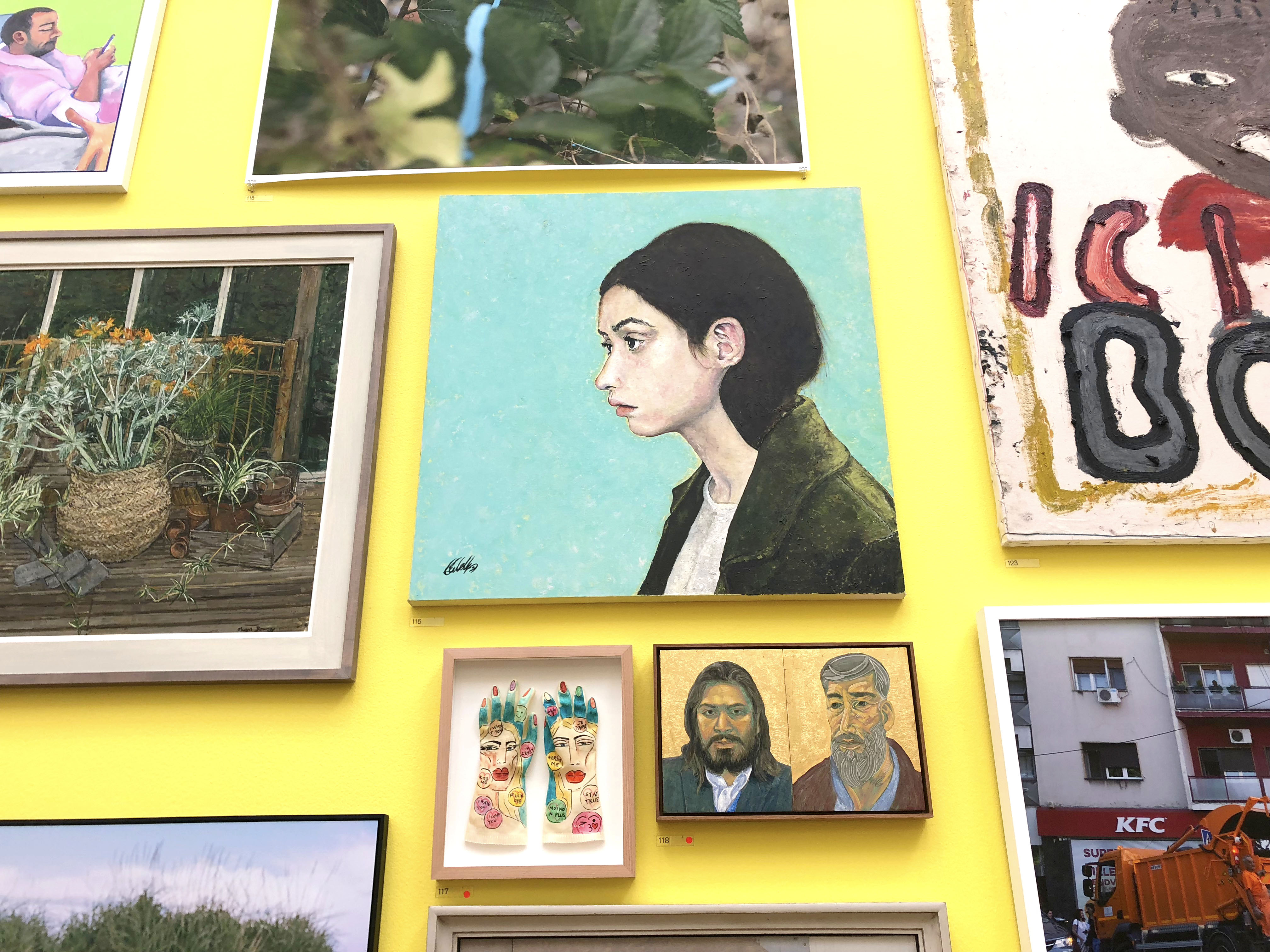
As you turn left out of the Wohl Central Hall, you find yourself in the bright yellow room that Grayson Perry himself curated. I was expecting this room to be a disappointment (as some celebrities rely on their fame to bring in the punters), but this room was chock full of beautiful pieces (in fact, it was my favourite room in the exhibition). There are hundreds of artworks in this room alone, so below are just a few of the bits that I picked out:
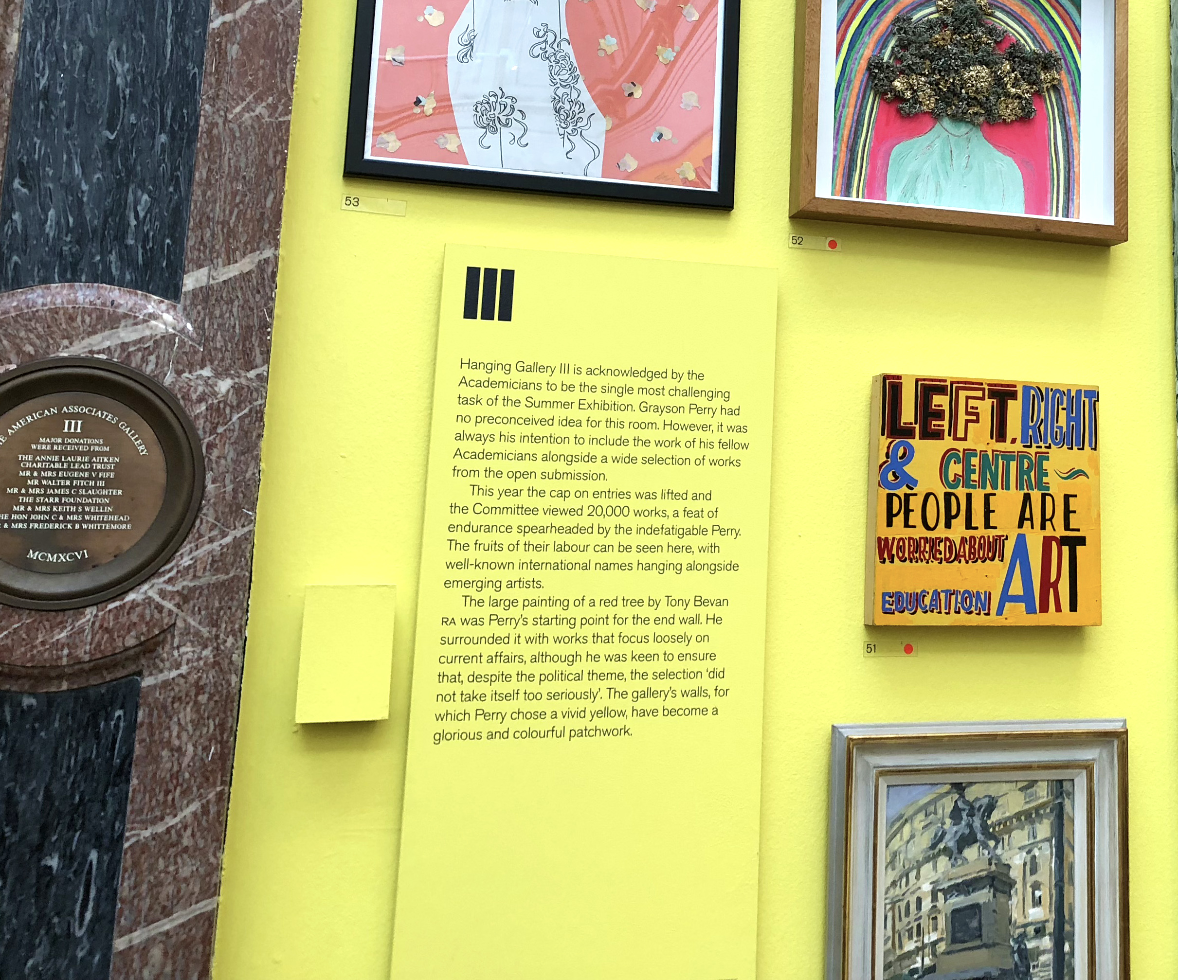
This was the little bit of blurb we had on the room that Grayson Perry curated. A big theme was politics.
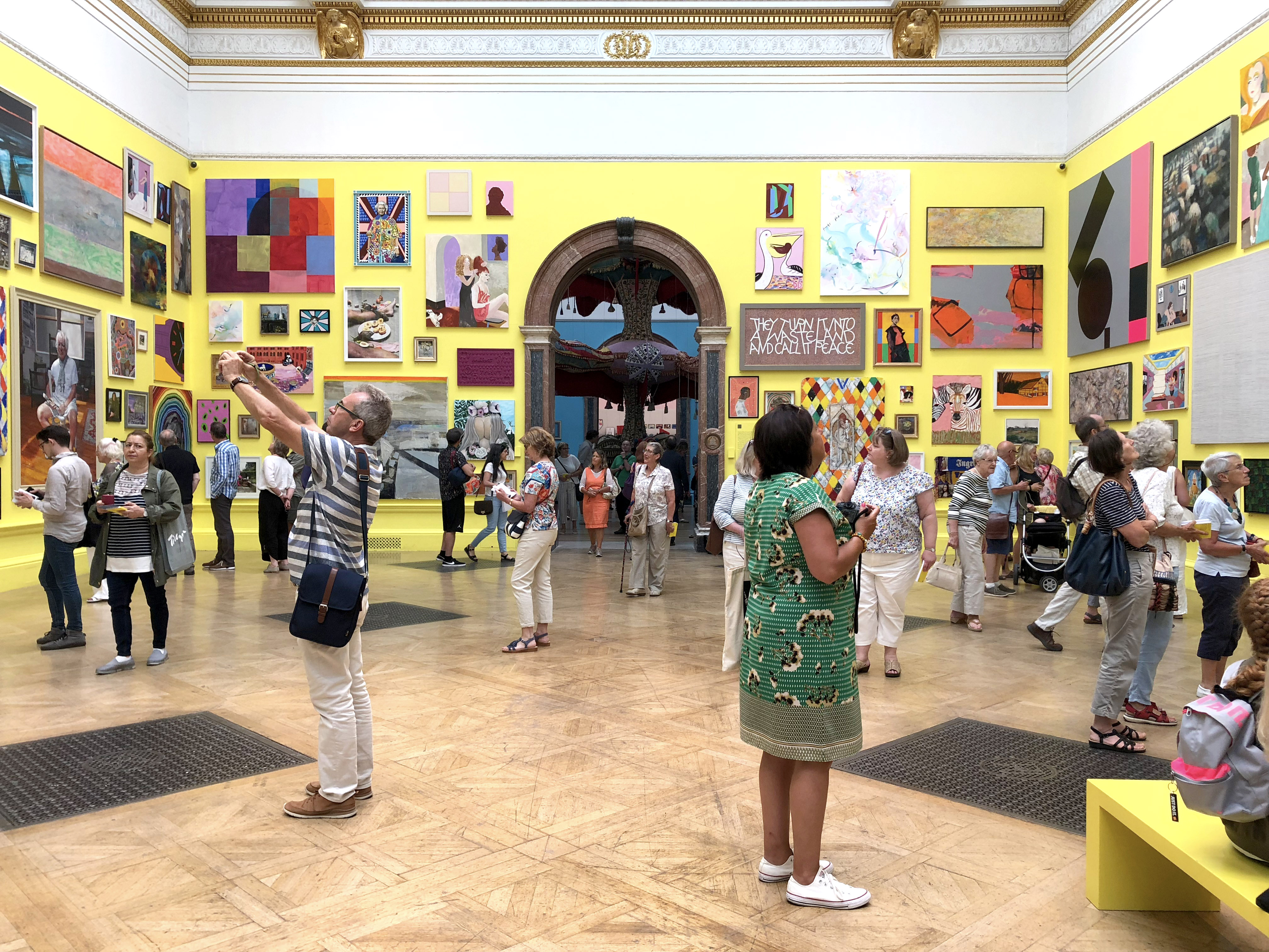
There’s so much art in one small space that it’s hard to know where to start!
I absolutely adored this green painting, Lunchtime by Sophie O’Leary, £2,000. The rich colours, the subject matter… everything about it. I could just picture that hanging in my home.
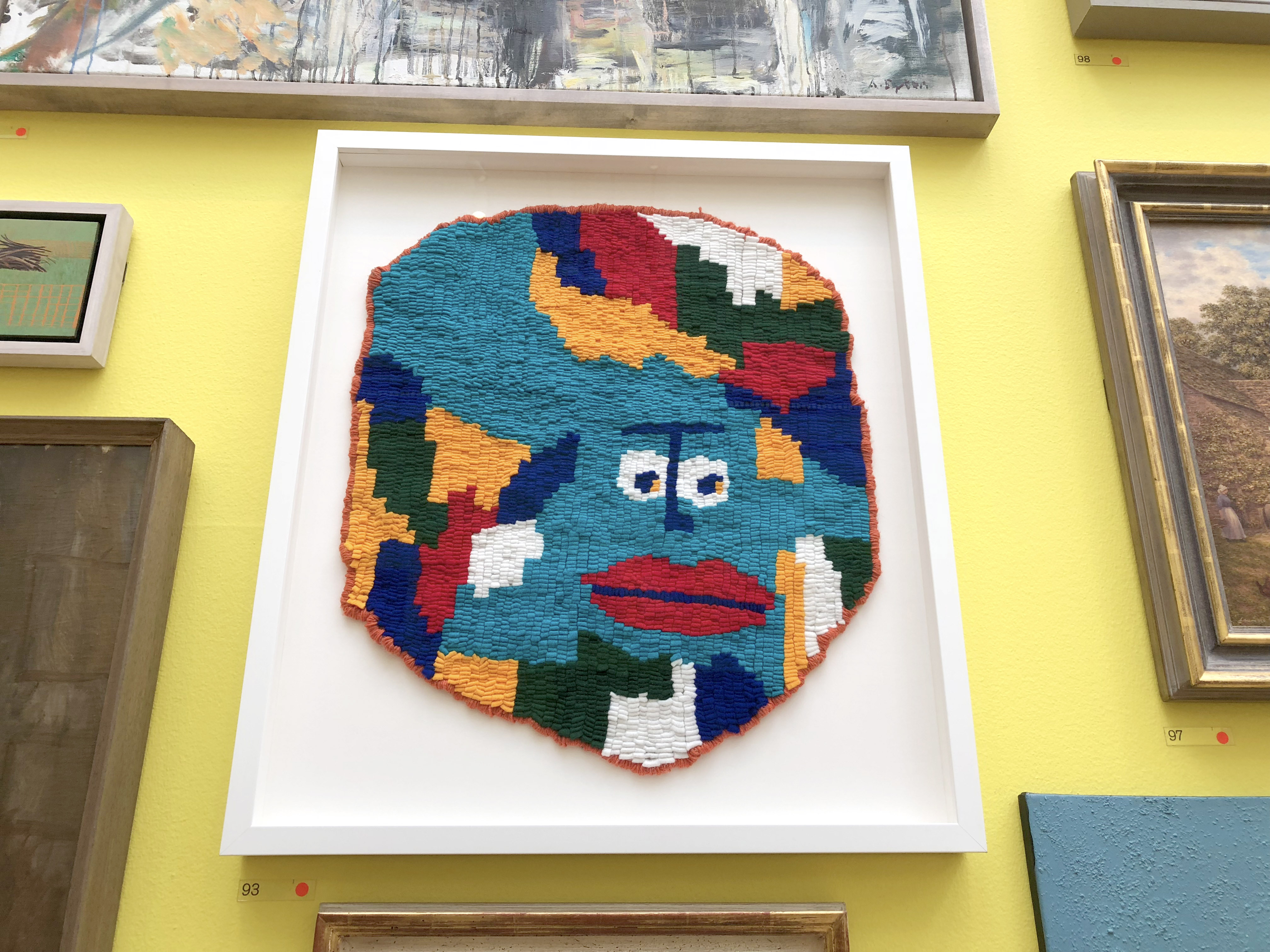
There were only two hooked pieces in the entire exhibition (which is two more than last year I guess), but this was one of them. It’s called Anthro Earth by Jess Warby, £3,000. I think this is a Marmite piece. You either love it or hate it. I won’t tell you which side I’m on 😉
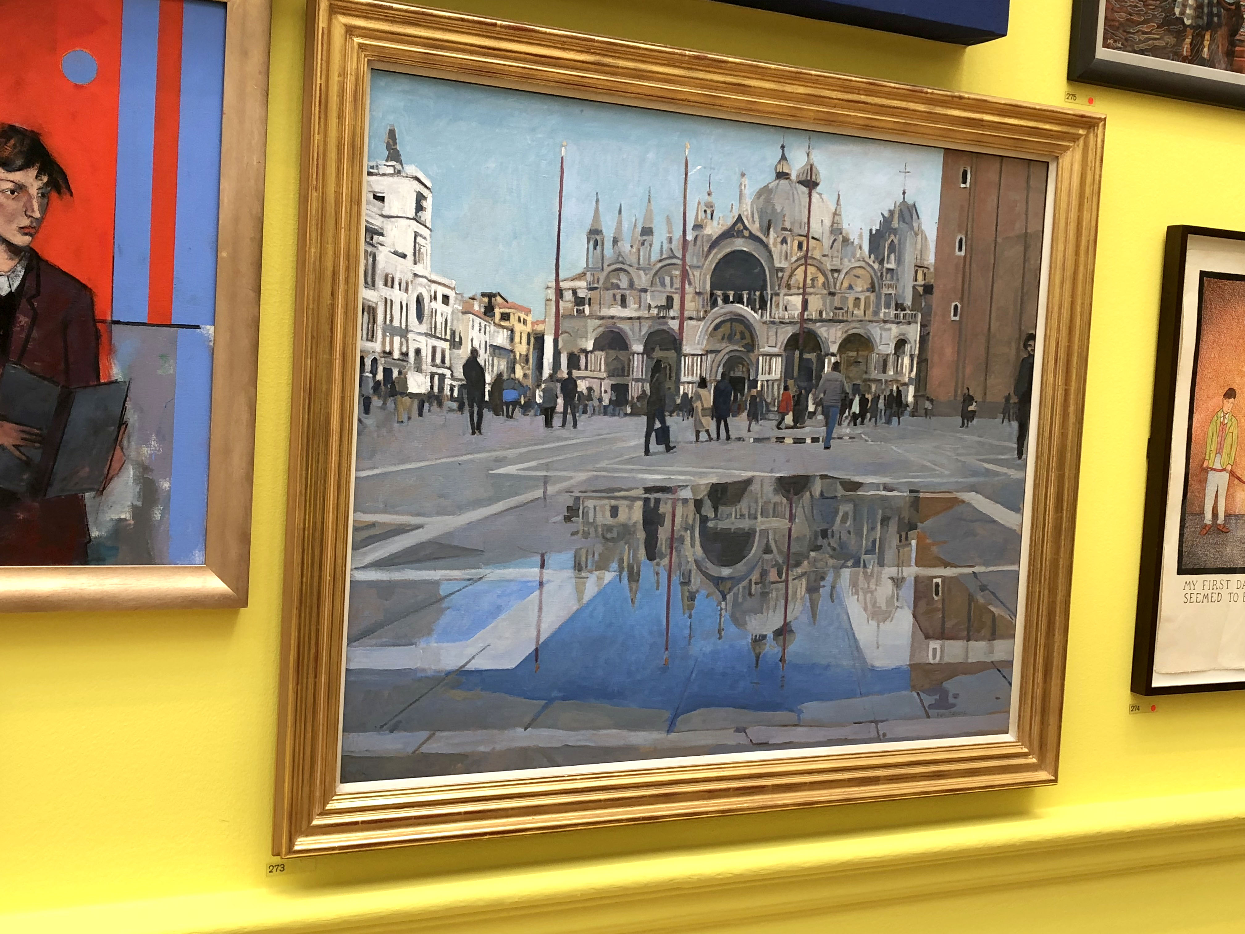
This artwork particularly stood out to me as being brilliant. The way that the artist has captured the reflection of the Doge’s Palace in the puddle is incredibly skilful. It is “Aqua Alta, Venice” by Ken Howard, £32,500. A bit out of my price range I think!
You can always rely on the Summer Exhibition for a good bit of humour (fortunately it doesn’t take itself too seriously) and these particular pieces had me laughing out loud.
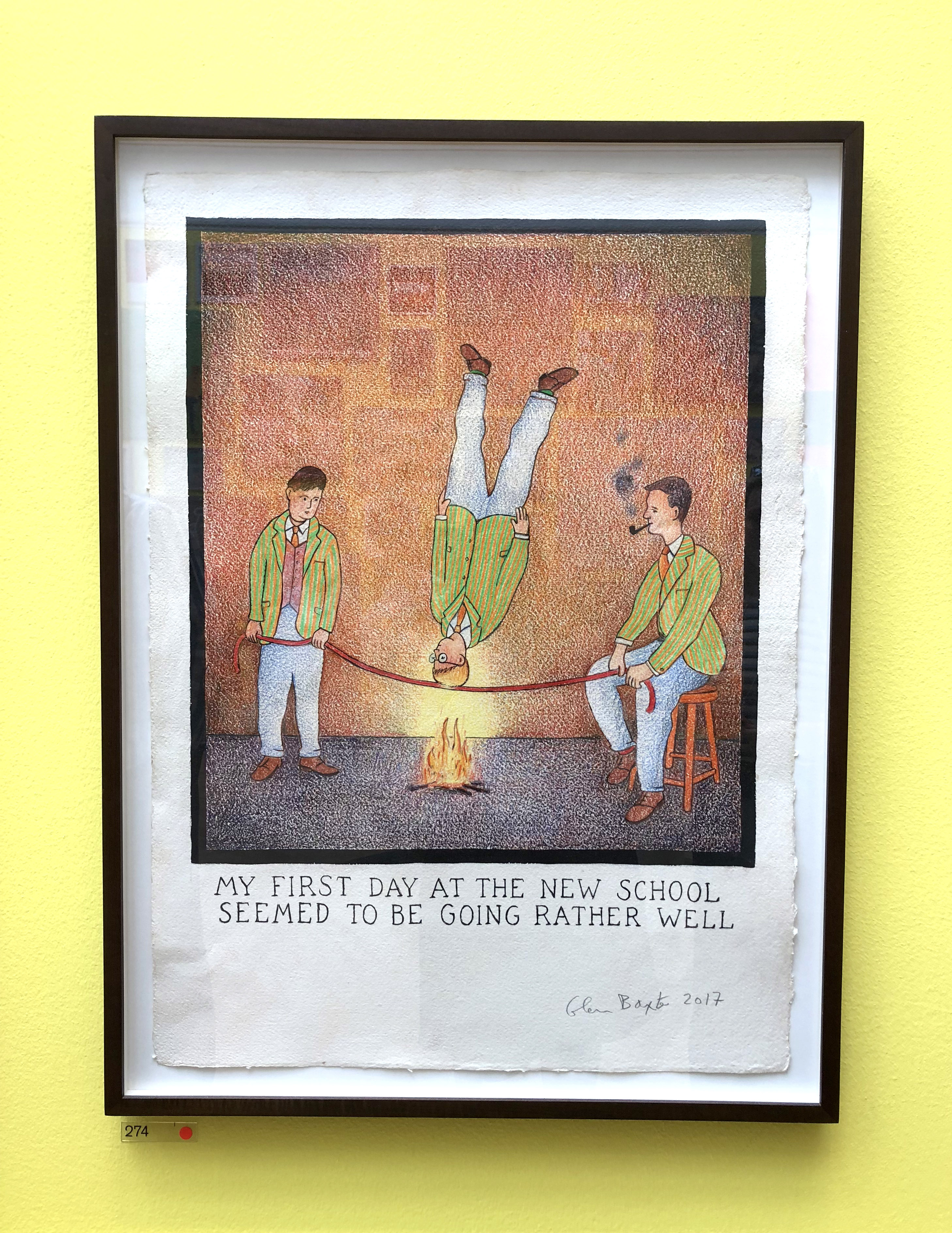
I thought this artwork “My First Day At The New School Seemed To Be Going Rather Well” by Glen Baxter, £7,500, was just hilarious.
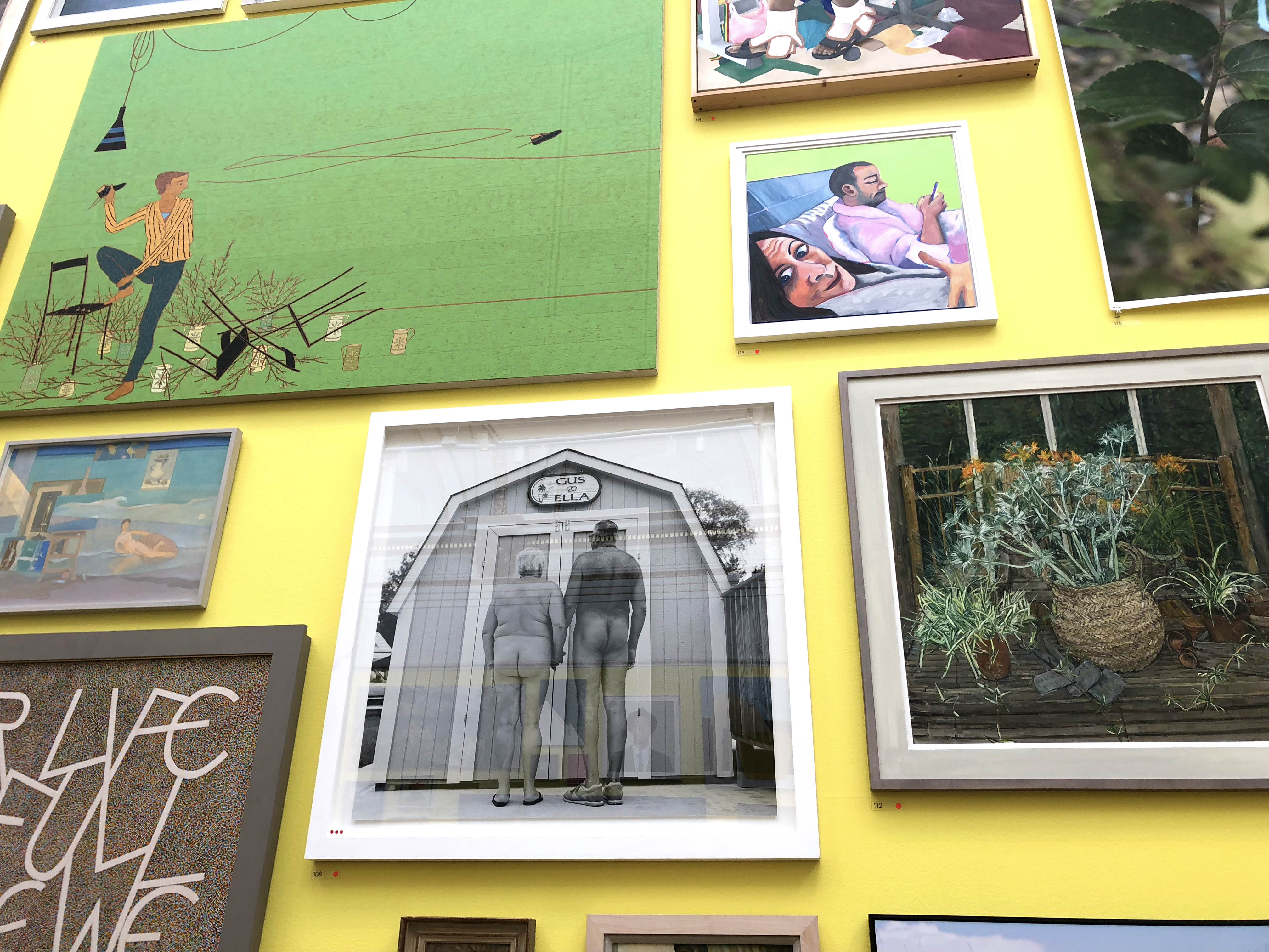
This one was amusing and cute at the same time. It is “Gus & Ella” by Keith Bernstein, £2,600.
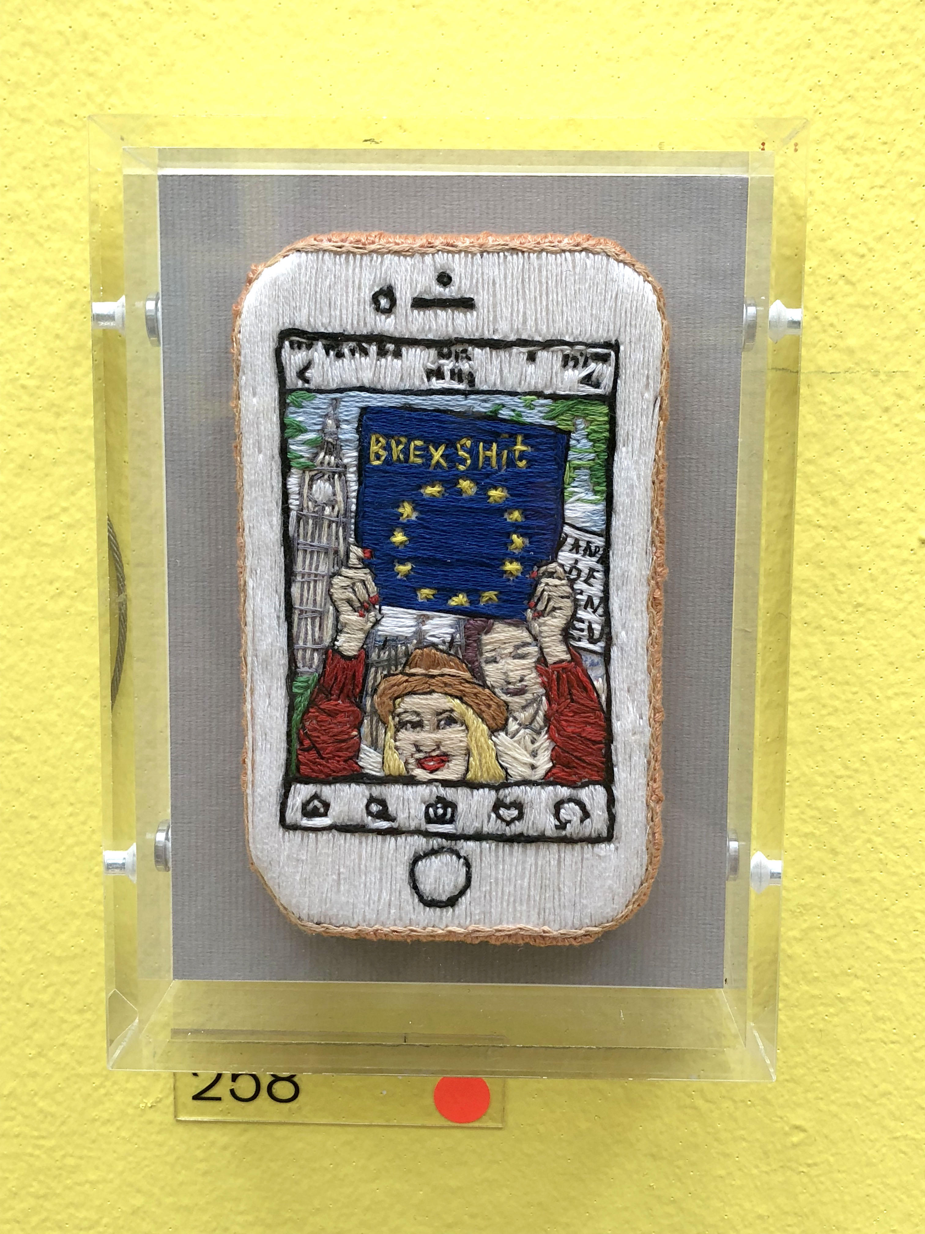
I couldn’t agree more. “Europe Running Through My Veins” by Tisna Westerhof, £790.
After visiting for a few years, you begin to recognise some of the same artists (probably RA fellows). I recognised the styles of many of the artworks in this corner…
Only at the RA Summer Exhibition would you get so many diverse paintings all in one small space.
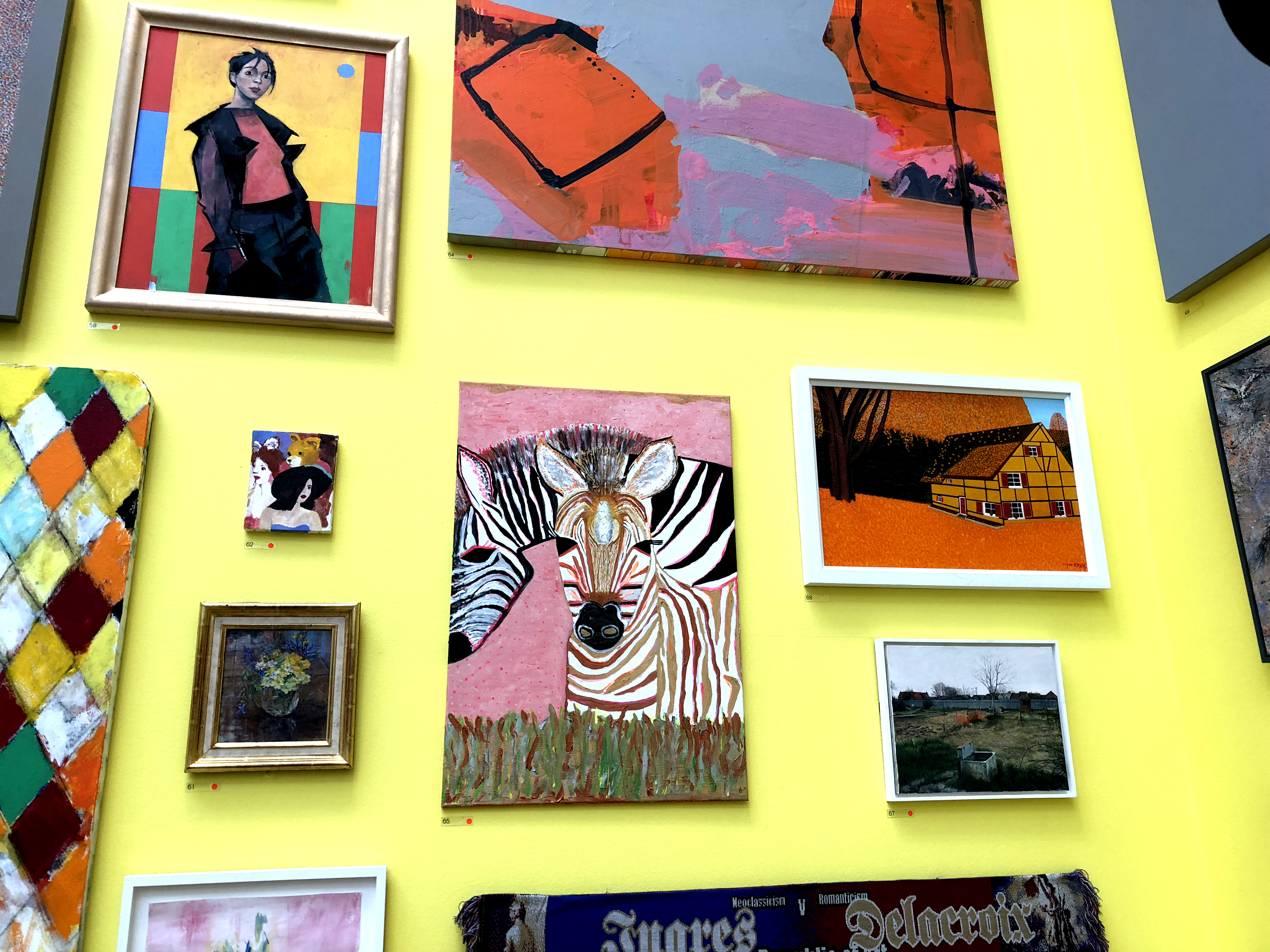
This zebra painting had happy vibes 🙂 “The Girls” by Bridget Harrison-Jeive, £750.
My mum visited the exhibition with my dad. This blue painting, “Falmouth, A Windy Day” by Philip Sutton was his favourite. It was valued at a whopping £46,000.
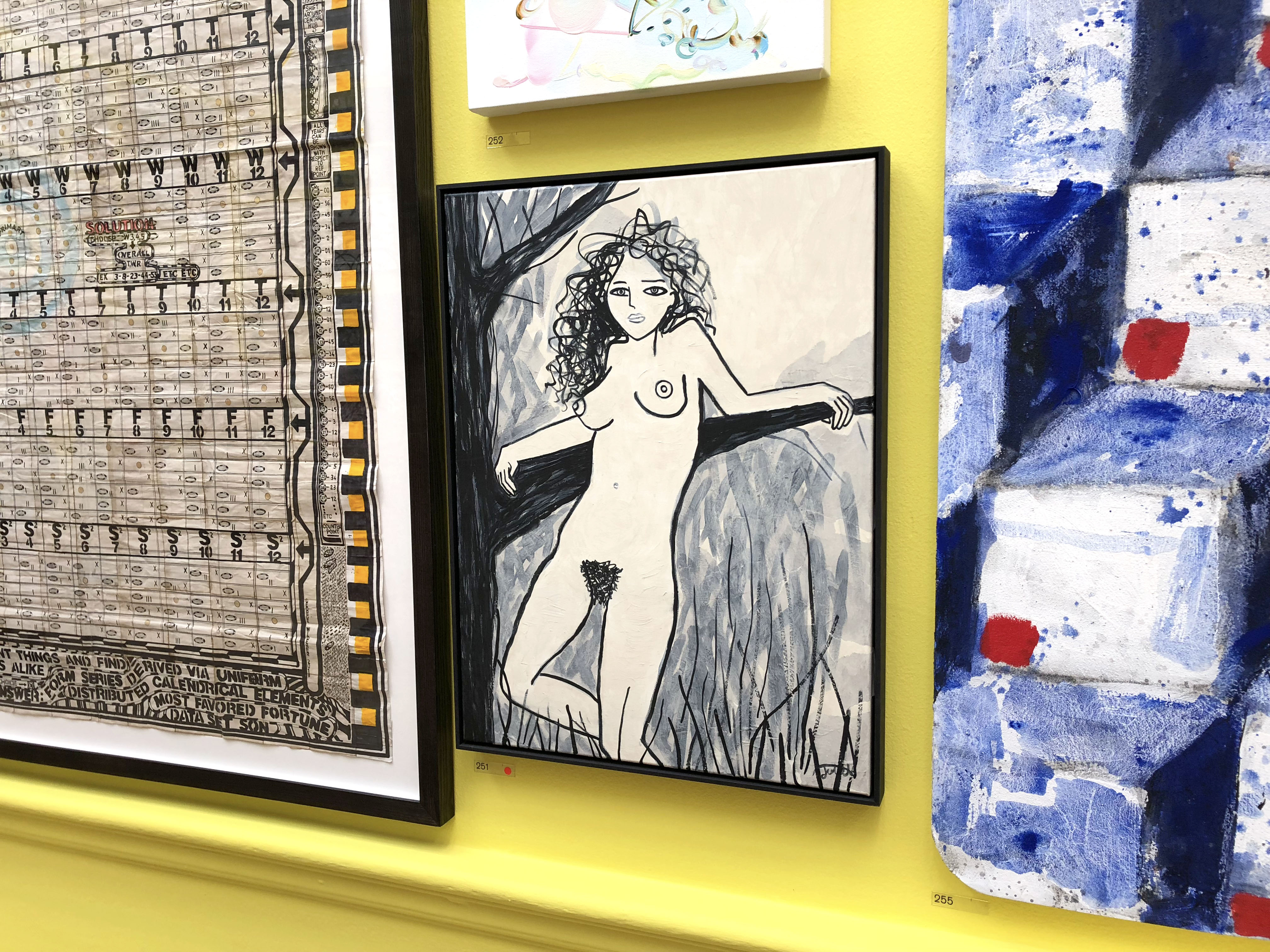
My dad’s favourite artwork was near one of my favourites. I really liked this black and white nude, “The Garden of Venus” by Juliet James, £1,200.
My nude lady painting was also pretty near this slightly strange embroidered blob. I tried to take as many pictures of the textile pieces in the show as possible, but this one really didn’t tickle me. I can appreciate the skill that went into making it but the “face” (if that’s what it is?!?) really creeped me out.
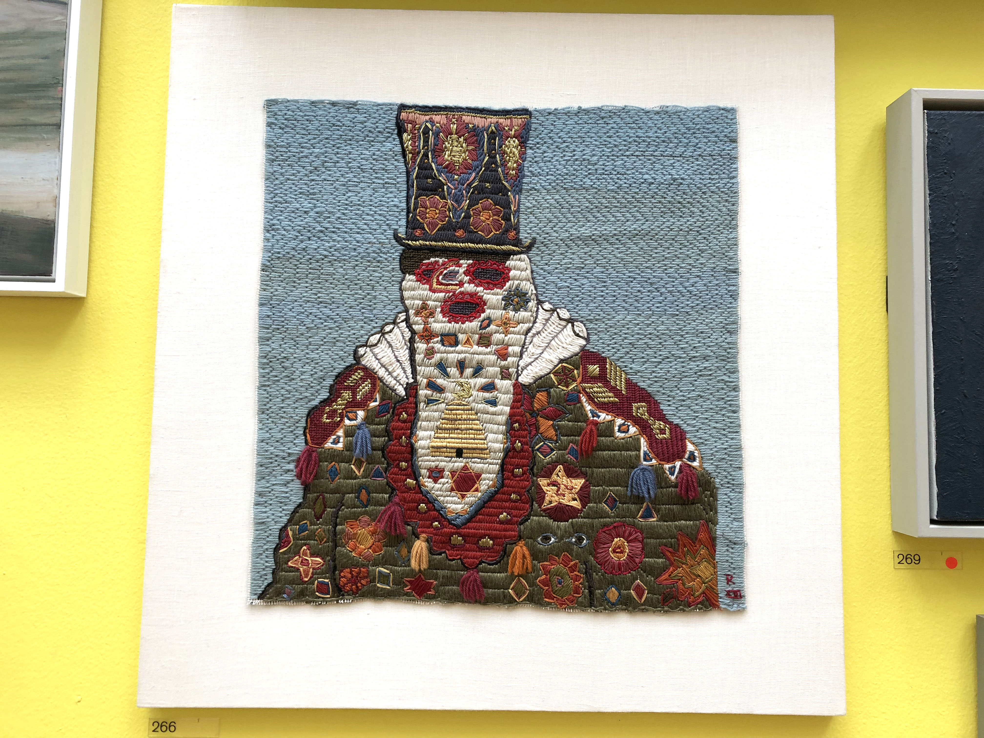
“Map Mundi I” by Renata Adela, £6,200.
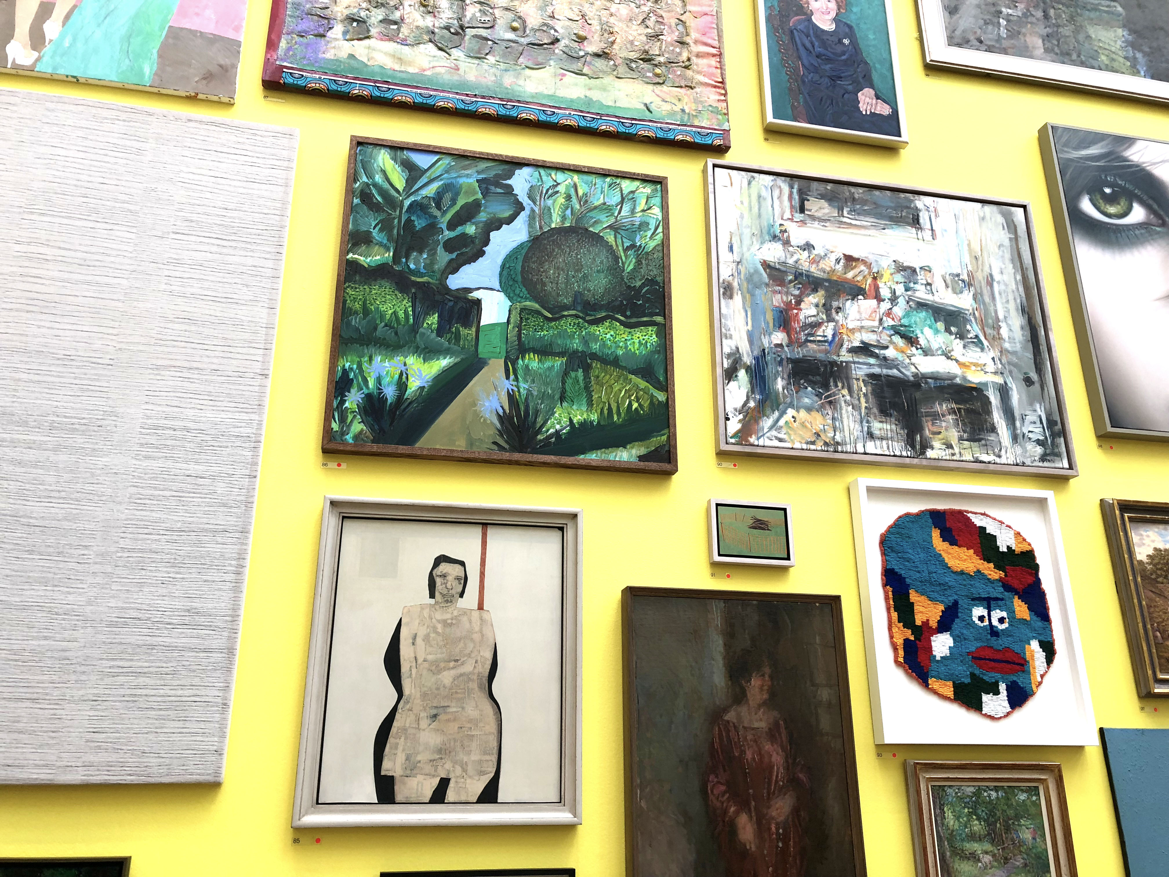
There was another artist who cross stitched on top of vintage photos. These were quite nice, but I’d have liked to have seen some bigger and more in-your-face pieces. It was quite easy to miss these small artworks even though they were quite lovely.
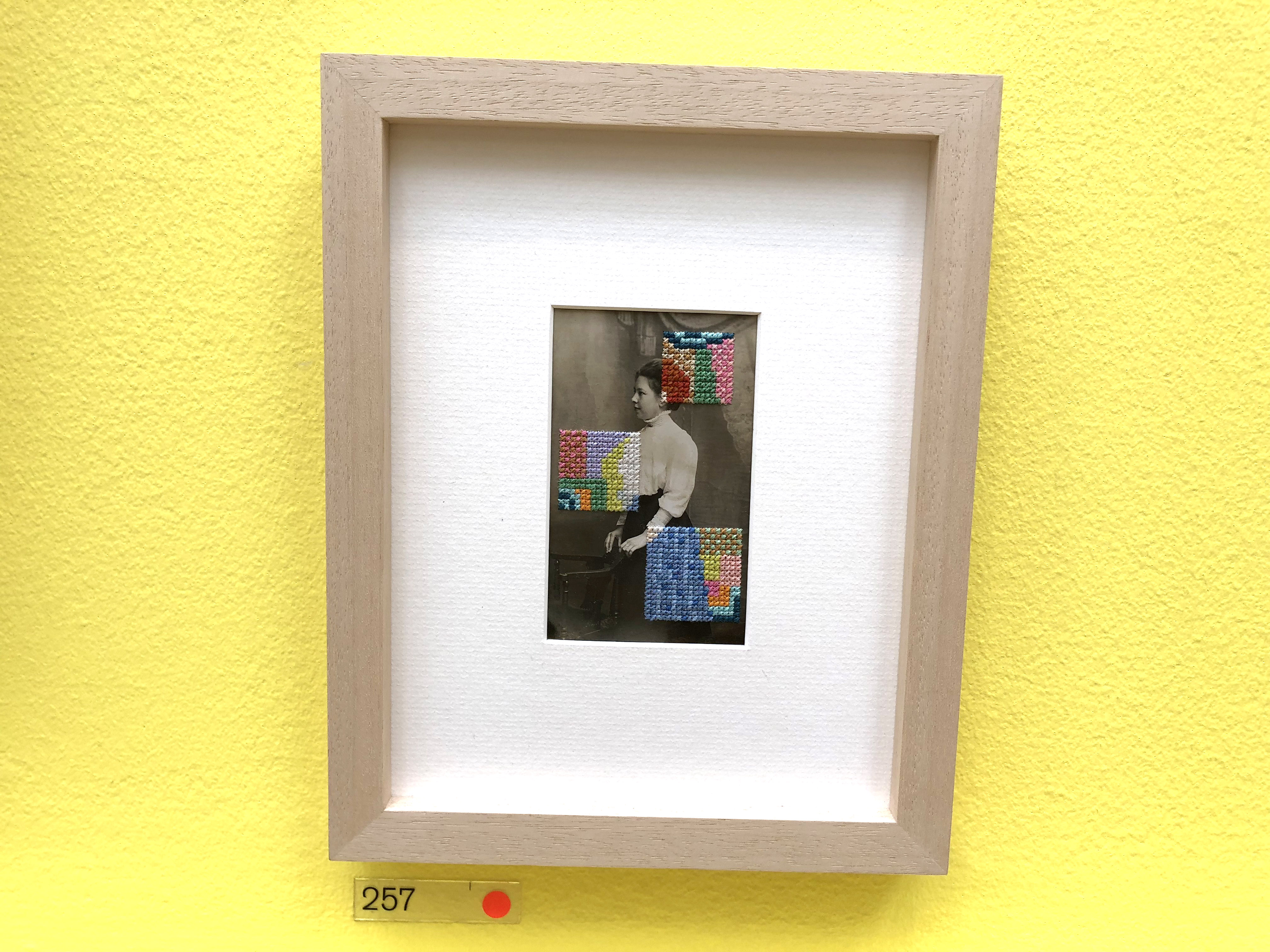
Cross Stitch on a vintage postcard. “Emmeline” by Francesca Colussi, £375.
The Queen was quite a big theme in this year’s show – perhaps because of the hype around the Royals with the Royal Wedding? Either way, I thought this artwork of The Queen in colourful clothing was just what the doctor ordered. She sure can rock a shirt dress.
The Queen in ‘Grayson Perry’s’ Coat by Sudjadi Widjaja, £1,010
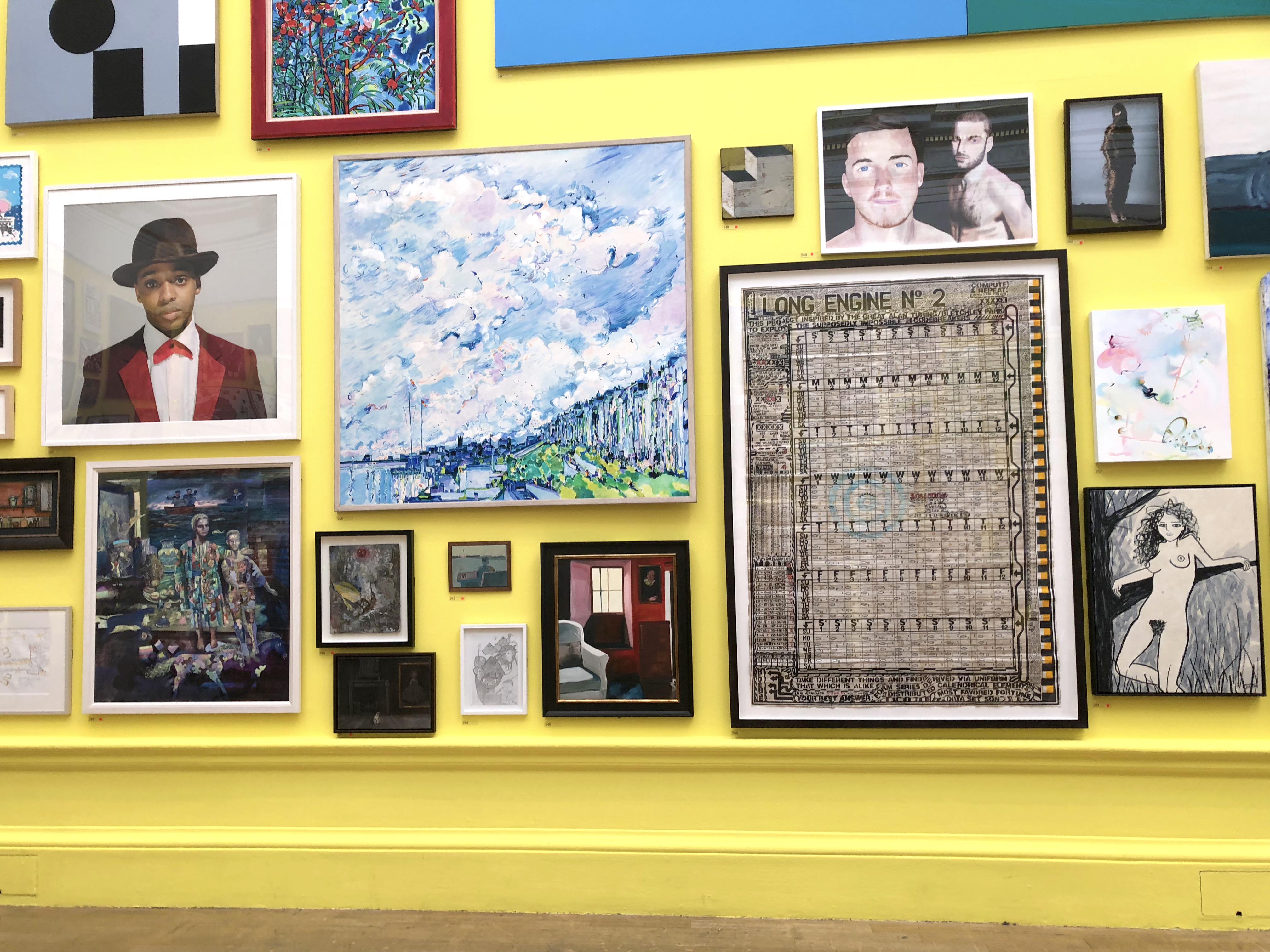
One of the great things about the RA Summer Exhibition is that you’re continually finding corners and clusters of beautiful and colourful artworks. It’s a truly immersive experience.
There are bold and bright artworks everywhere at the Royal Academy Summer Exhibition 2018.
These weren’t my favourite pieces, but they were definitely striking…
There was something very thoughtful and doleful about this portrait of a woman. “No Title” by Lale Karayaka.
The next couple of rooms weren’t my favourites, but I’ve picked out a few pieces that I think are worth mentioning. Plus, it’s all subjective anyway so maybe they’ll turn out to be your favourite rooms!
Gallery IV and Gallery V:
The centrepiece of Gallery IV was this giant painting, which looked like the buildings I’d come across in Uzbekistan. I wouldn’t have it in my home, but it certainly made a statement as you walked in….
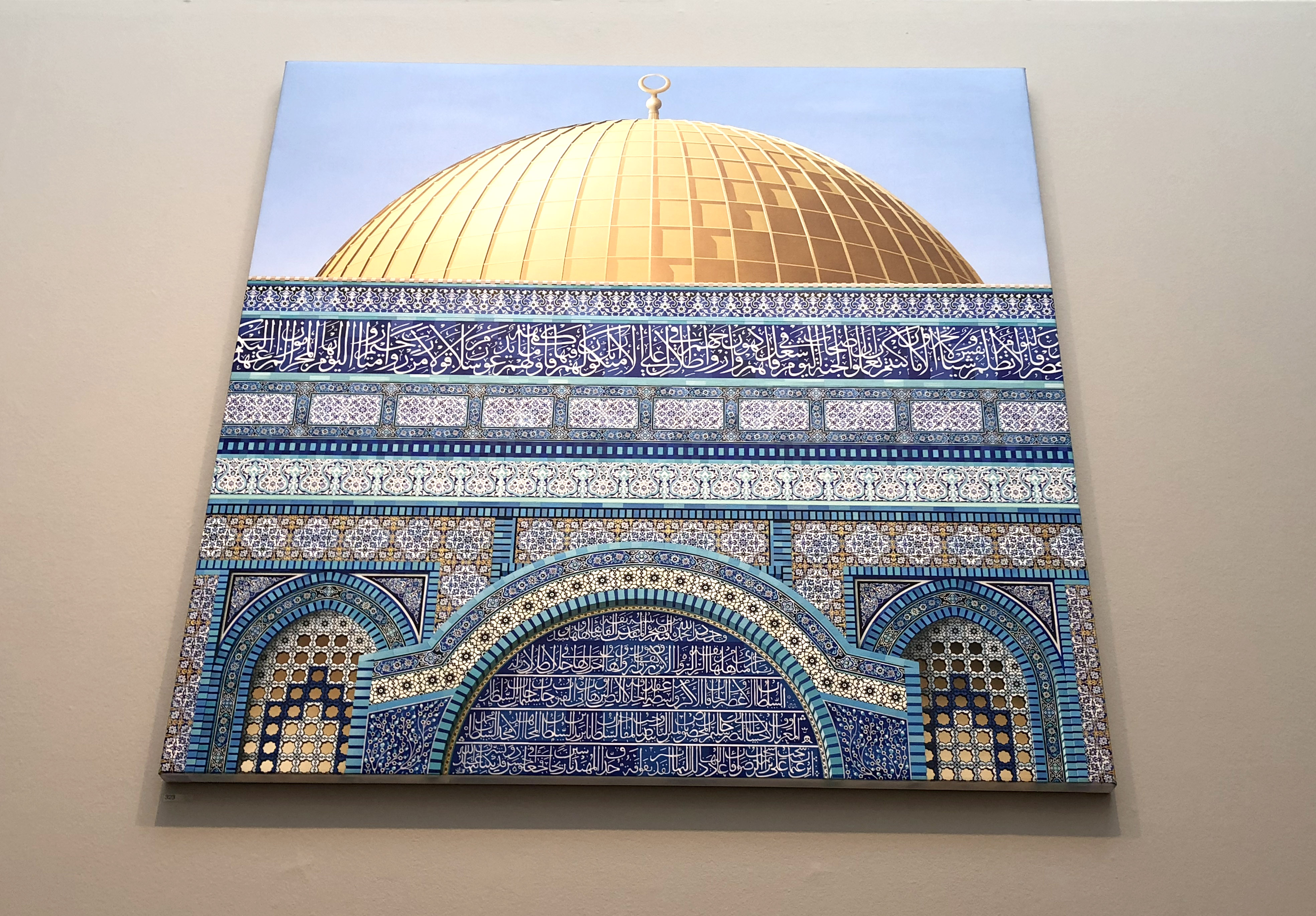
As you enter the third room, the space is dominated by this giant artwork, “Dome of the Rock, Facade” by Ben Johnson, £120,000.
The below artwork took me back to childhood games of “Operation”, so I guess that’s a good thing 🙂
Operation anyone?
These rooms weren’t quite as jam-packed with art as the previous ones and later ones. That may be why I wasn’t quite so keen.

The artworks were a bit sparser.
I thought this would make a very nice rug design… Untitled- Motif by Ashley Collin, £1,000.
This was my favourite part of these two rooms. I particularly liked the oil painting of flowers, (Untitled) by Elizabeth Power, £1,200.
And just for a little bit of light-hearted entertainment… comedian, Joe Lycett submitted “Chris” to the exhibition this year. Chris would set you back £12,500,000, but don’t worry as the deposit payable today is only £4,500,000.
Chris was unceremoniously displayed down in the corner of one of the rooms – it was pretty easy to miss the most expensive piece of art in the whole exhibition.
The entrance to Gallery V was flanked by two bejewelled guardians including Rufus 3rd…
RUFUS 3RD by Timothy Blewitt was made of wood, metal and costume jewellery.
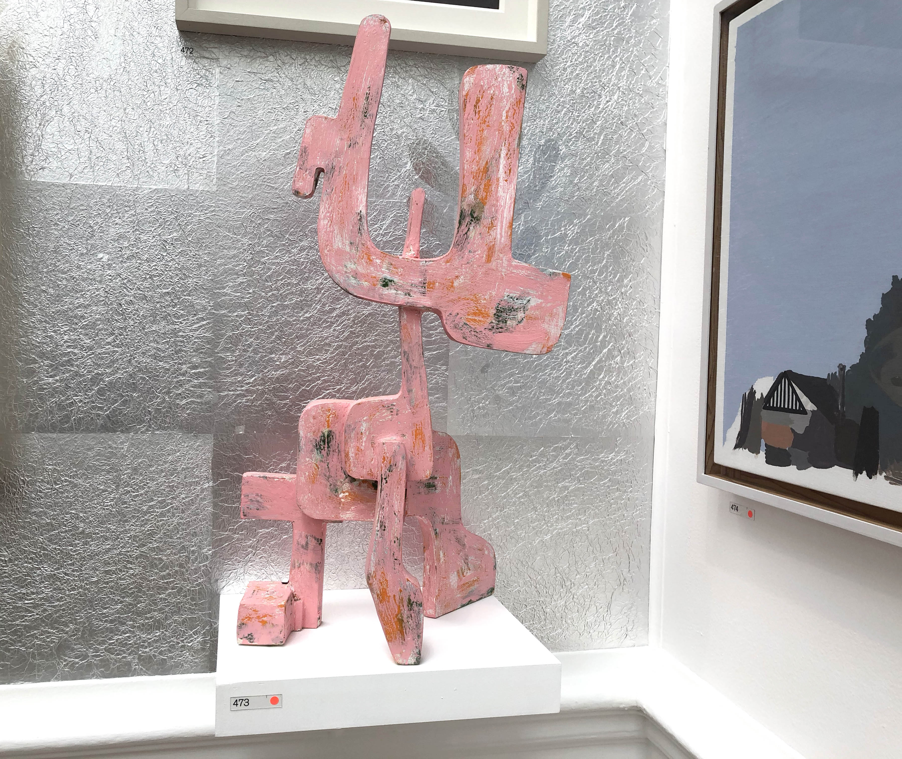
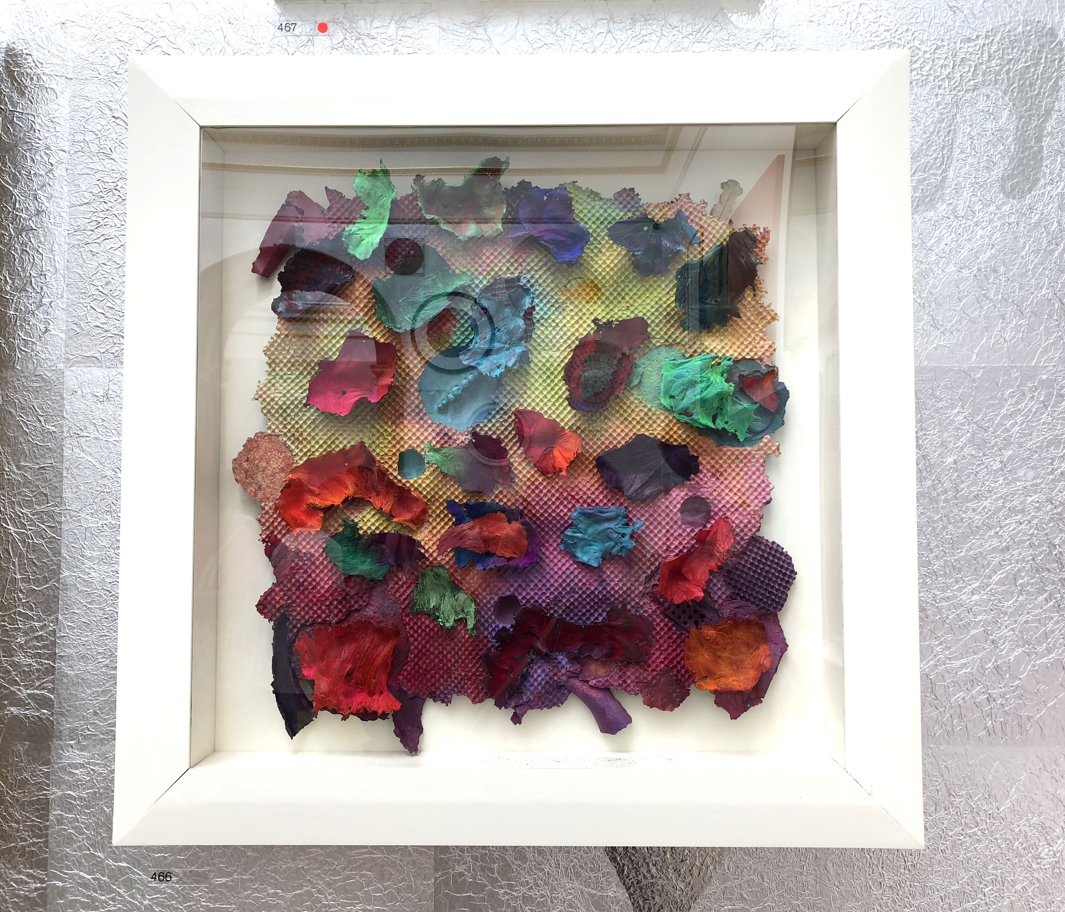
In Gallery V, two of the walls had been covered with silver reflective material to change the feel of the space. This gallery had some interesting pieces, but many of them were a little bonkers for my taste.
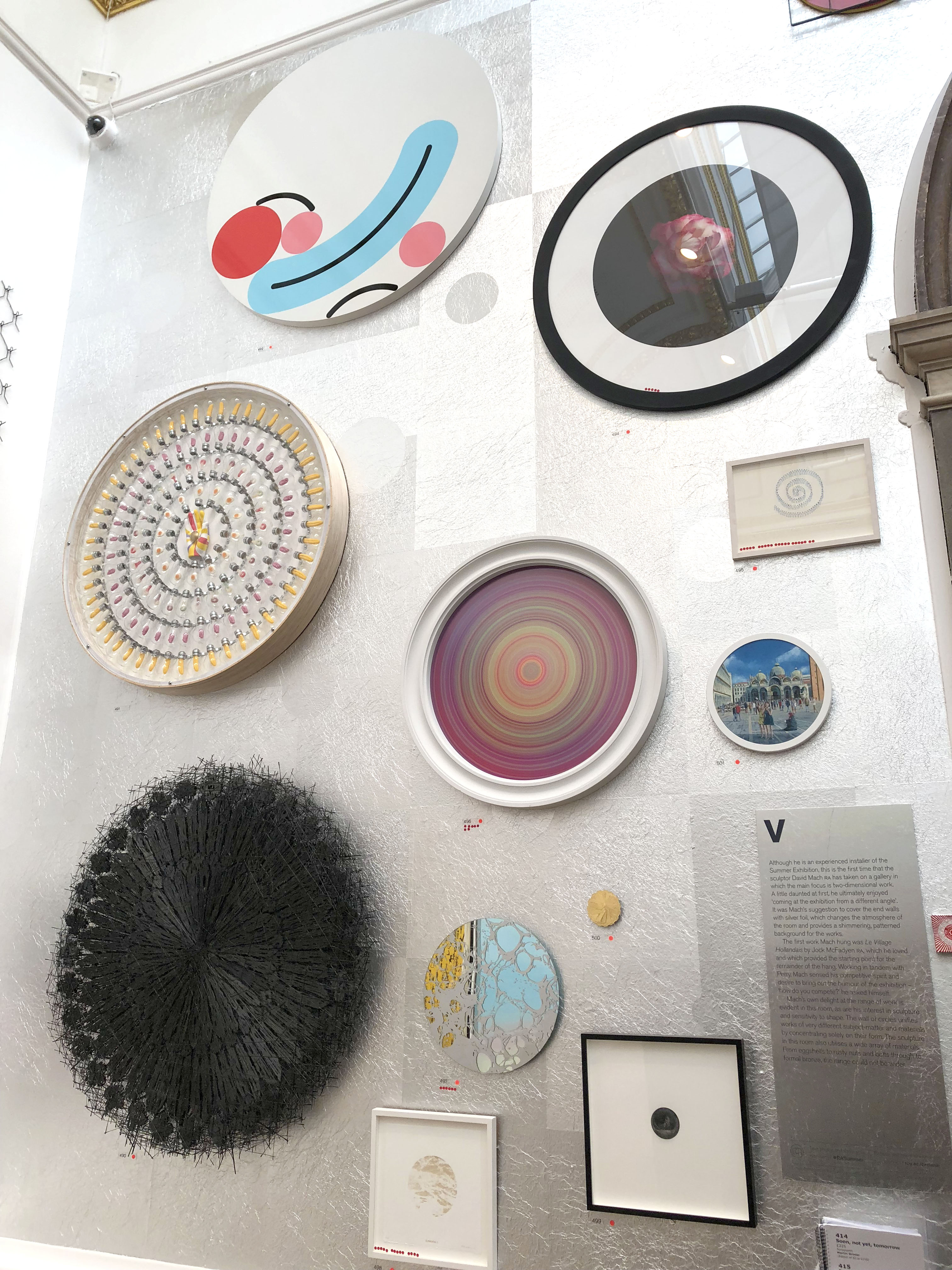
I liked how these circular pieces worked together, but I’m not sure that I liked any of them individually.
There were more sculptures in this particular room…
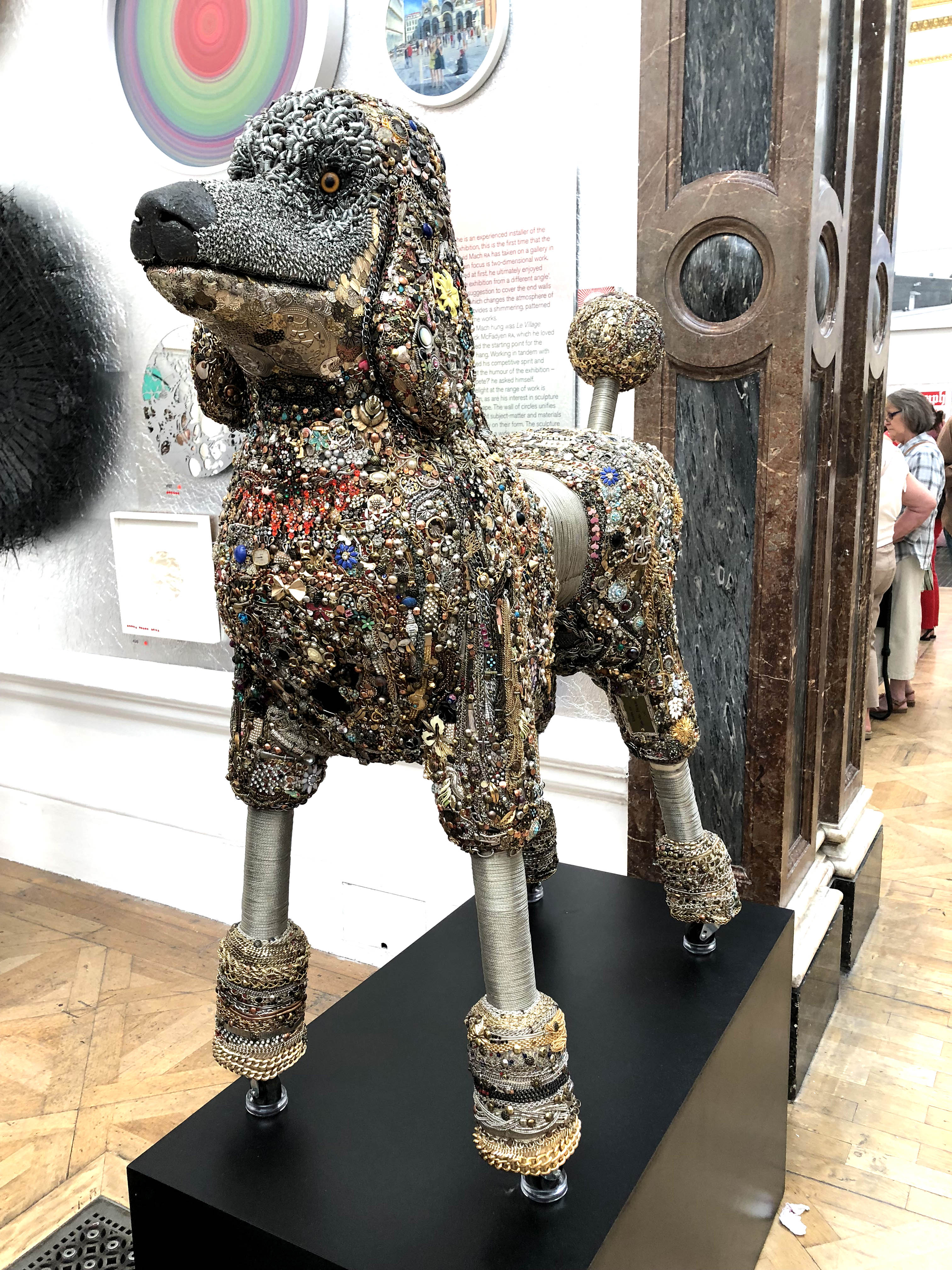
I liked the colours in this sculpture “Dog”.
The below artwork didn’t photograph very well because of the reflective glass, but the colours and textures were very rich and beautiful.
This artwork “Dawn Chorus” by Kenneth Draper sold for £15,500.
Hats off to my friend Kate for noticing these old Sooties. This piece is called “Cabinet Members” by Sharon Wilson, which I have to admit is a pretty hilarious name.
I’m pretty sure that my mum probably has a Sooty lying around at home – maybe she should frame it 🙂
I obviously have very expensive taste because one of my favourite pieces in this year’s exhibition was Le Village Hollandais by Jock McFadyen, which would set you back £45,000. Hmm, maybe not…
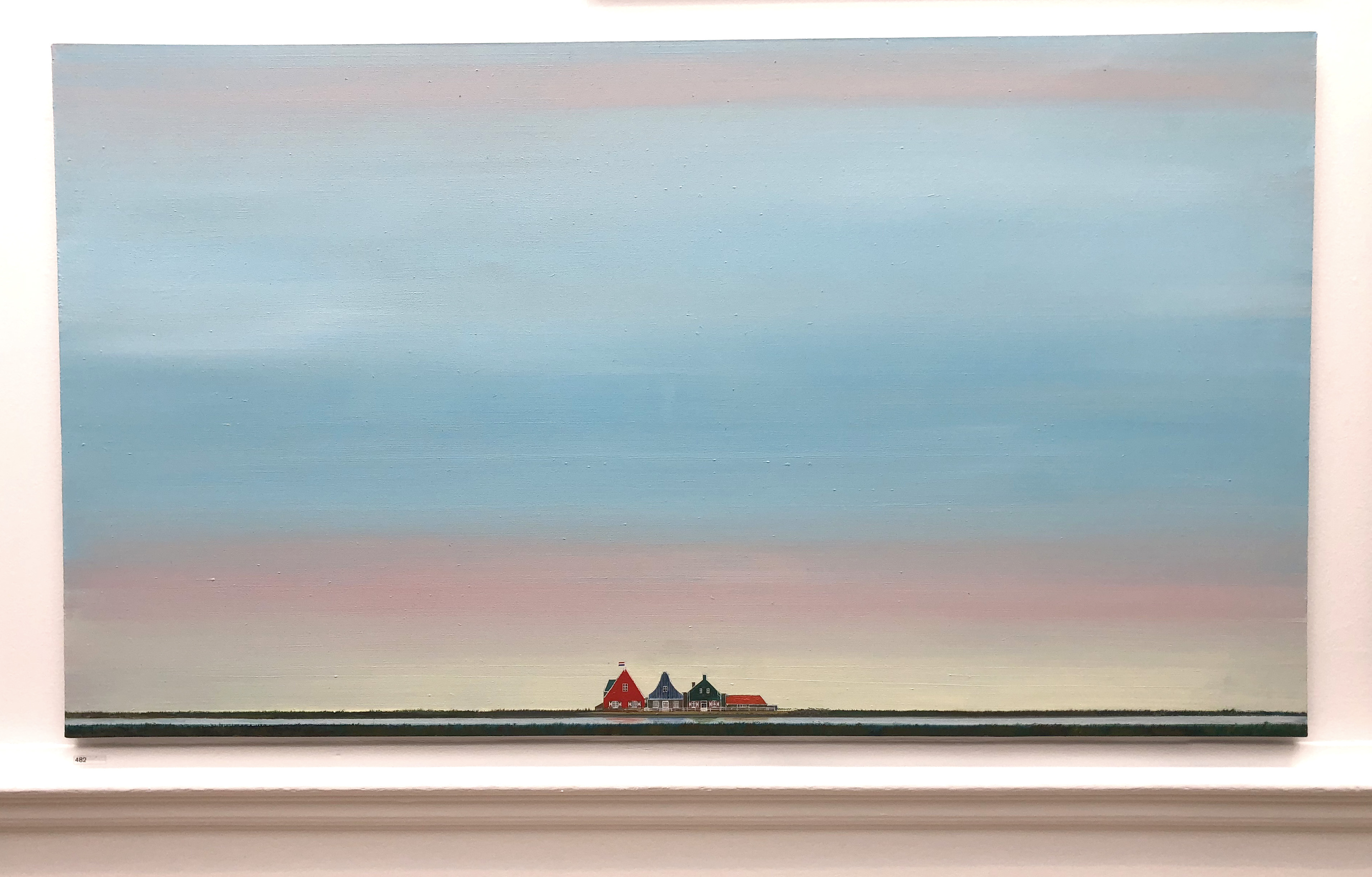
Le Village Hollandais by Jock McFadyen
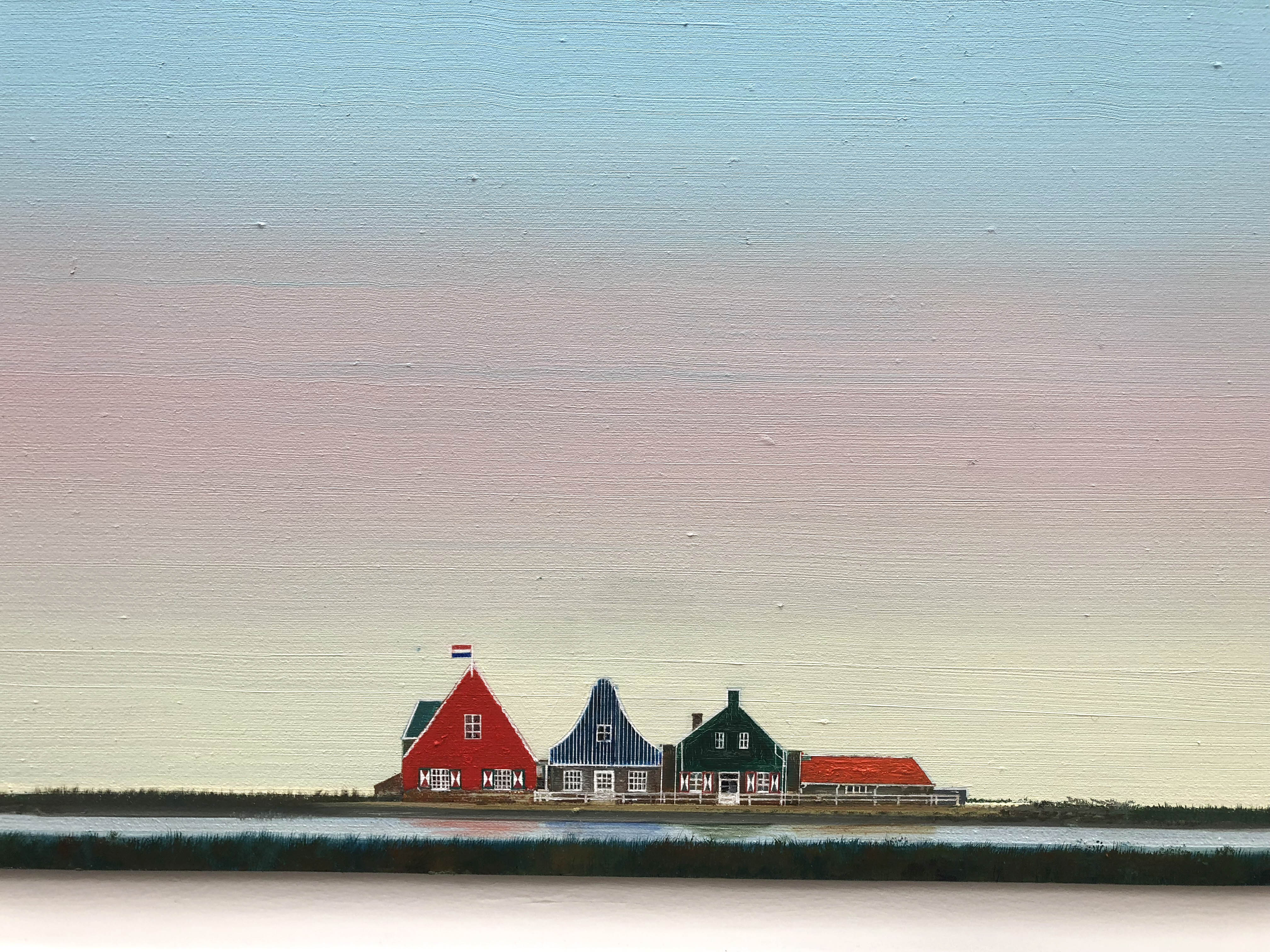
It’s only when you get close up that you manage to see the exquisite detail.
I’d love to know how Debbie Lawson went about making this particular artwork as it seems incredibly difficult technically.
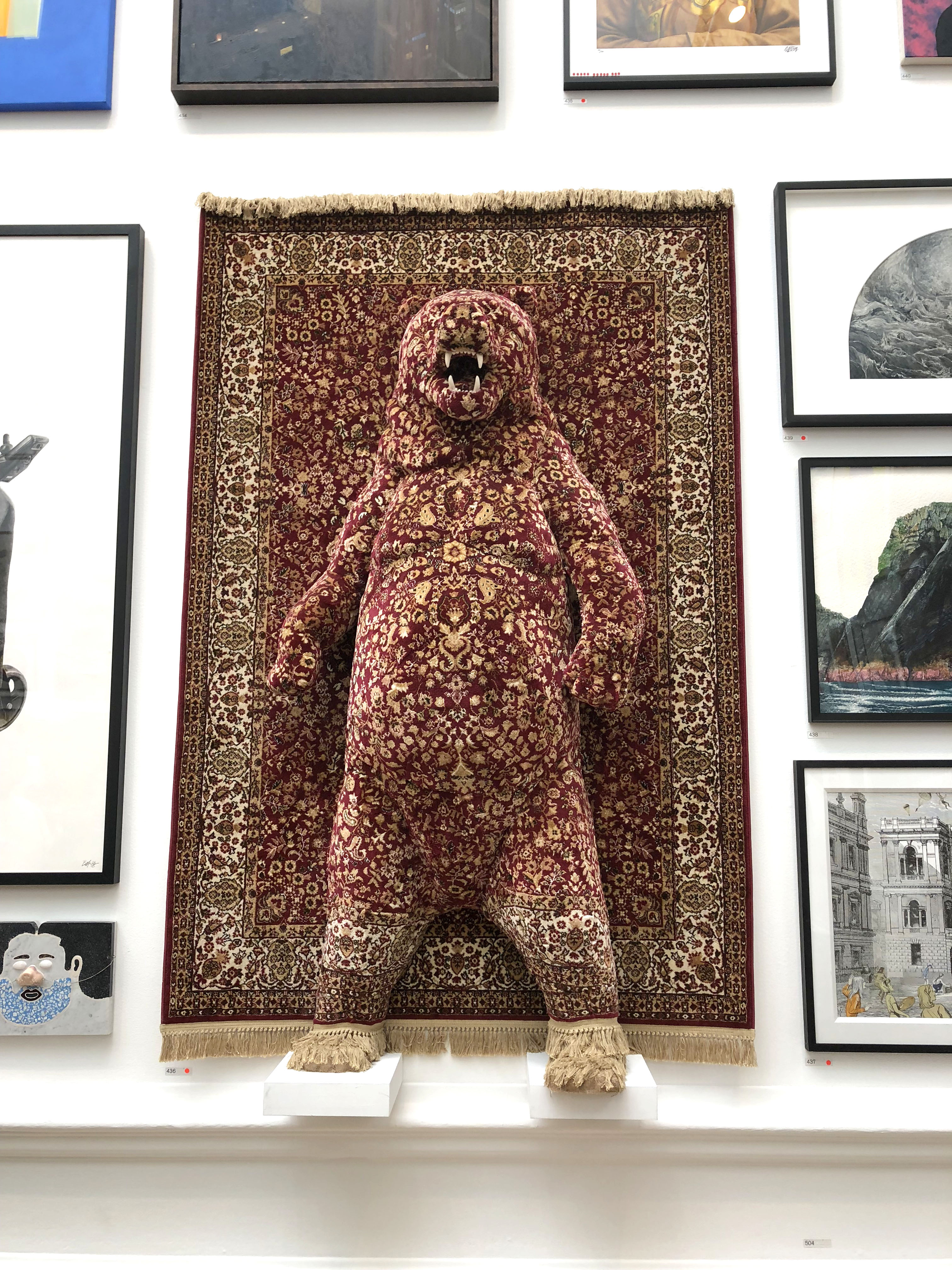
Red Bear by Debbie Lawson, £14,500.
The below painting is one that you may just have skipped over, but I thought it was quite fun.
“Under Siege” by David Mach
Gallery VI:
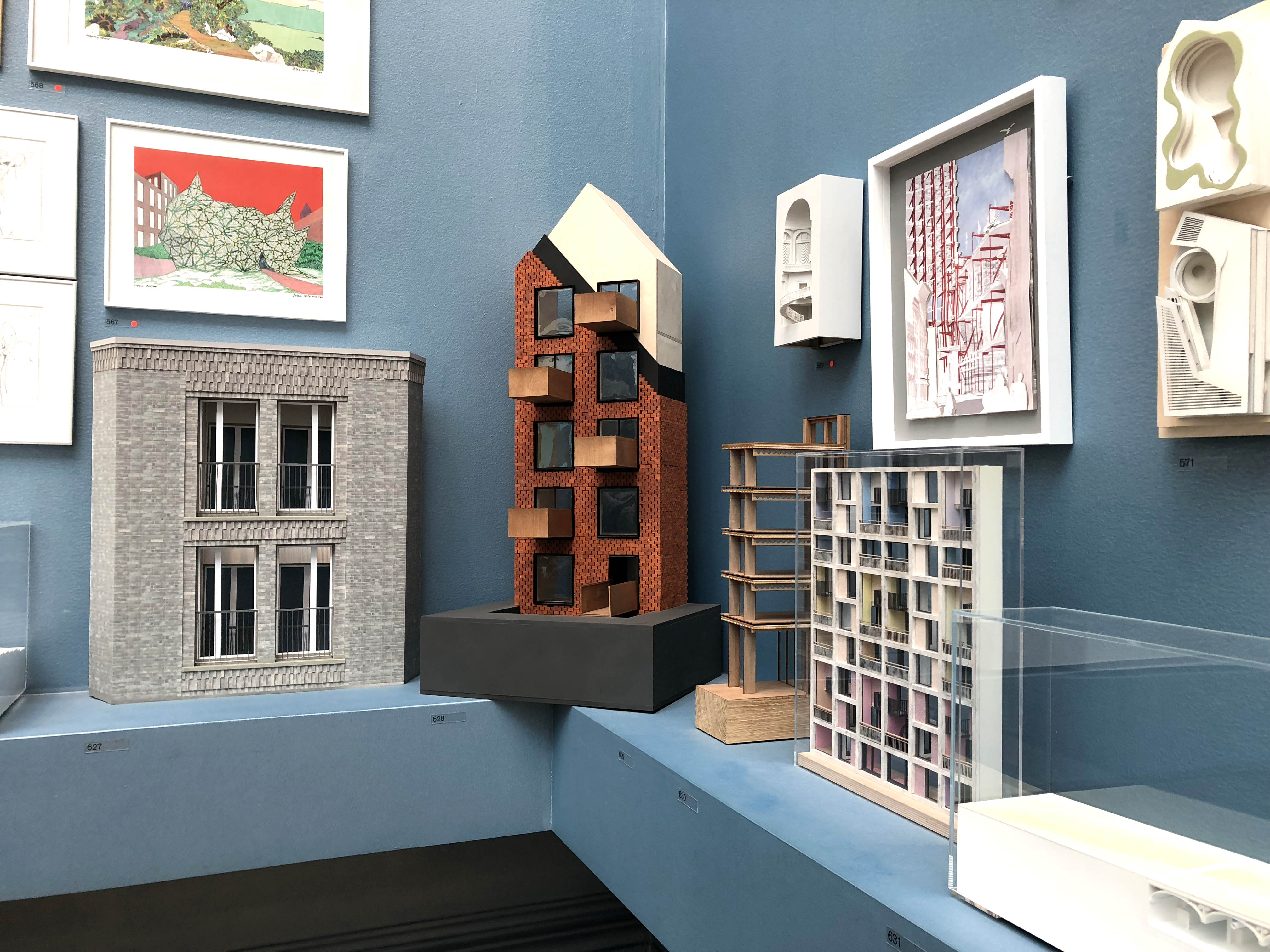
The next room in the exhibition was put together by Piers Gough RA. The architectural gallery is never my favourite room in the show, but this year’s space was more engaging than normal as Piers Gough wanted visitors to wander through the models like a city (that’s why they’re at eye level).
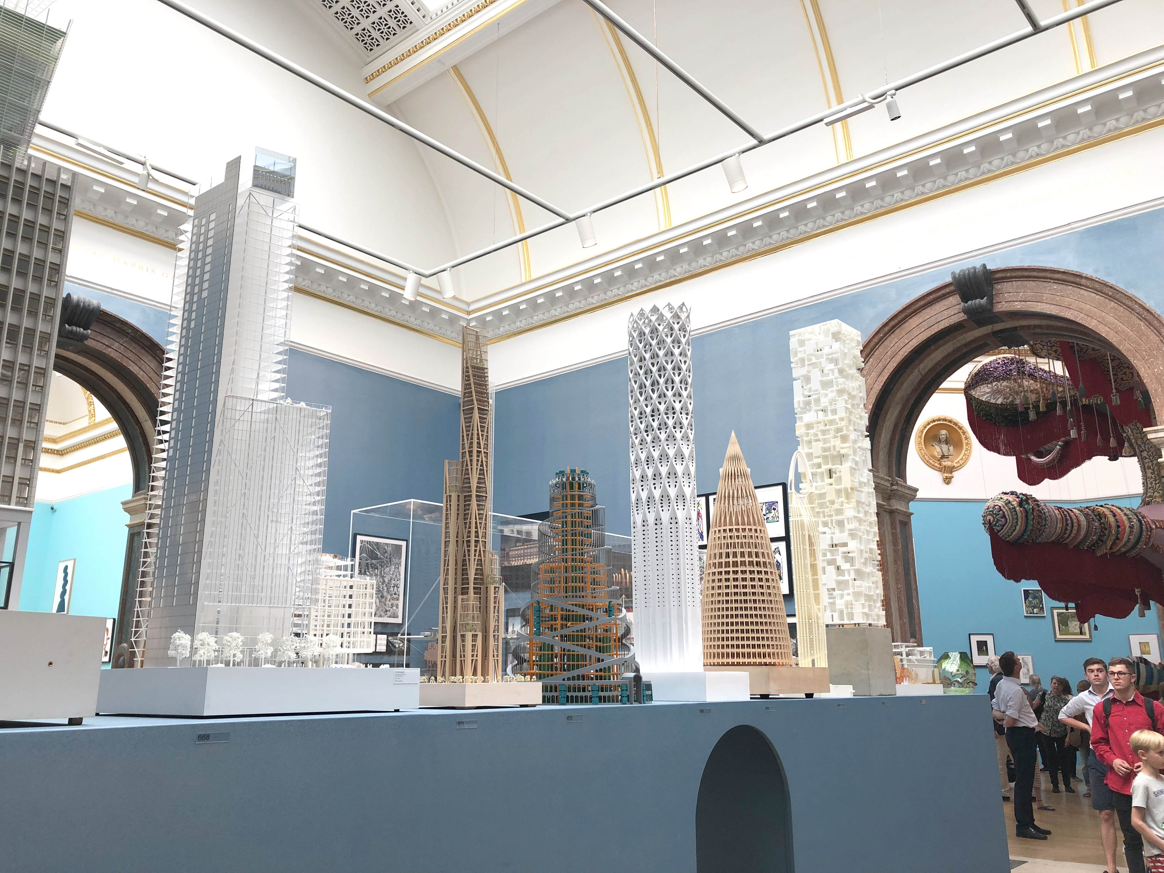
The architectural room was much more immersive this year with many of the models up at eye level.
Do you love or hate this idea of multicoloured skyscrapers?
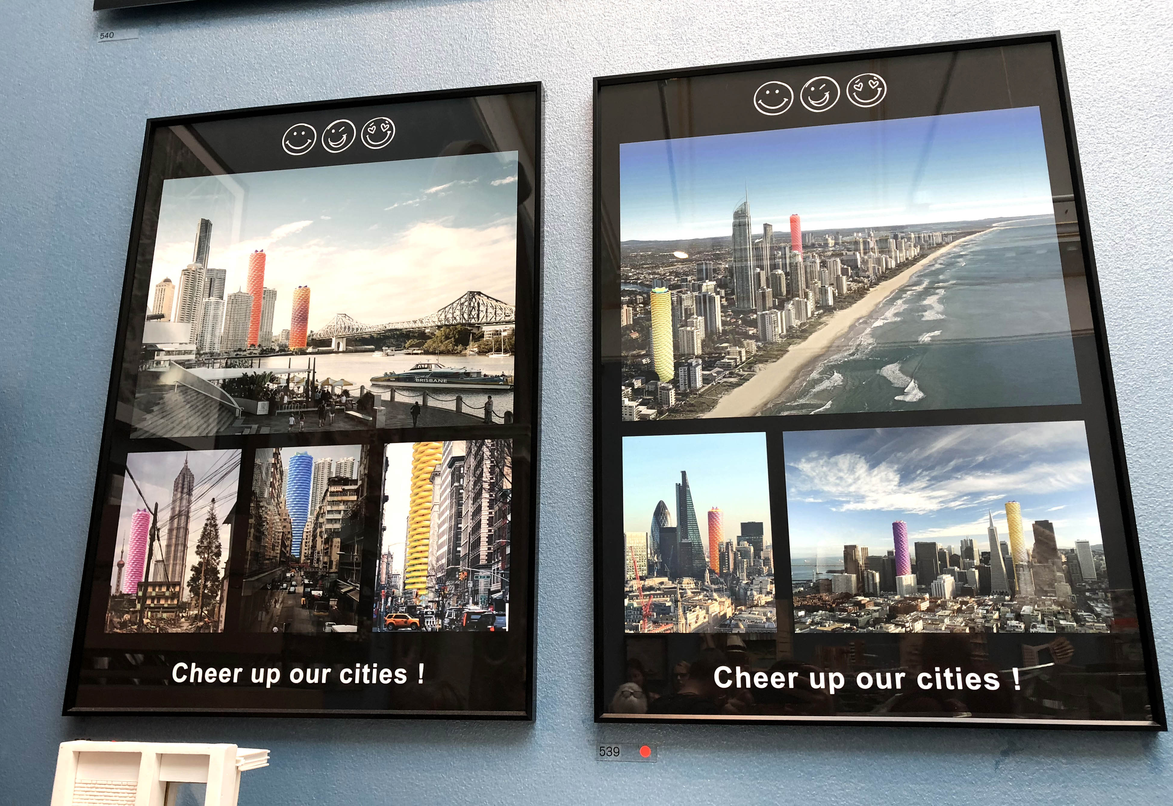
Would London look more cheerful if new-builds weren’t all grey?
Architectural models at the RA Summer Exhibition 2018.
The room doesn’t just have models in, there’s also plenty of art dotted around. I like the name of this particular piece “A Kerfuffle of Collisions”.
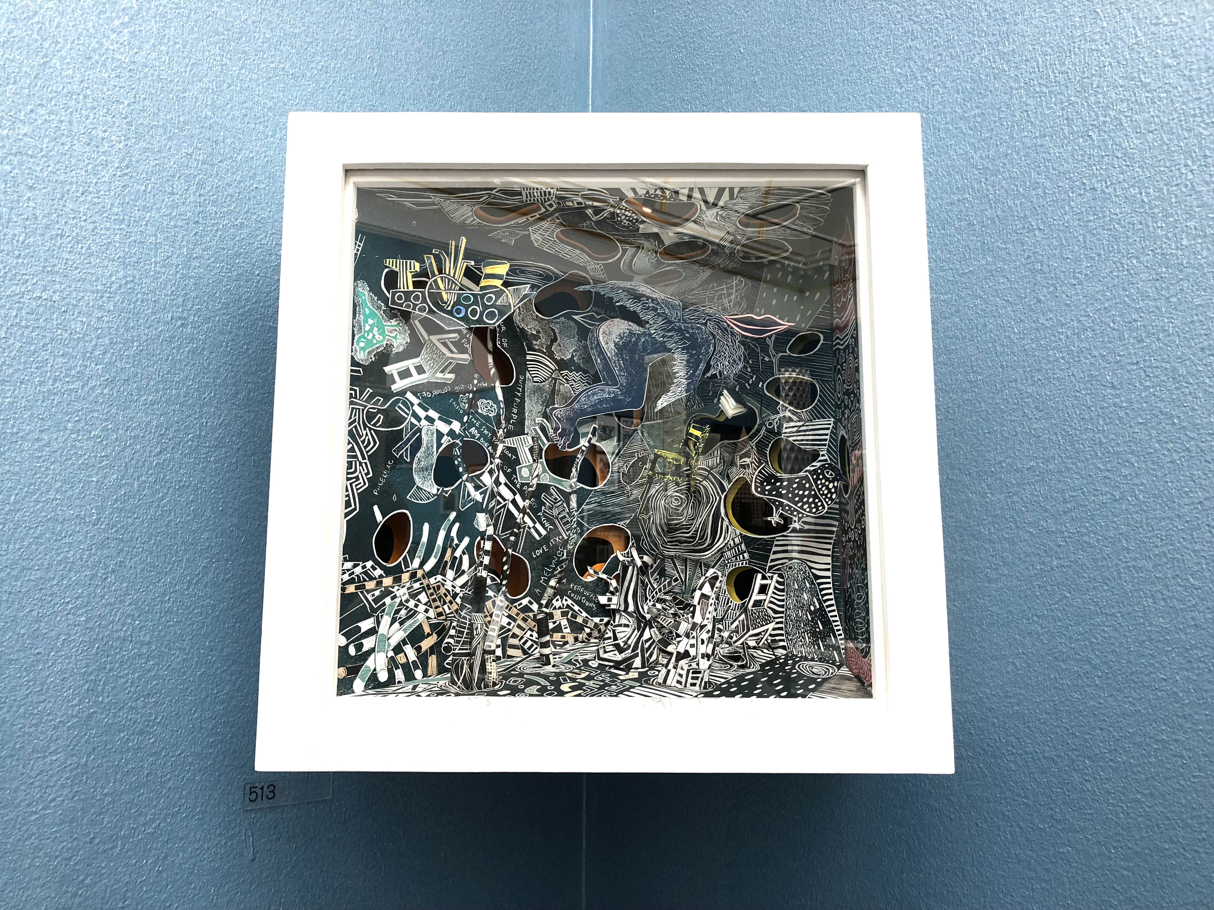
A Kerfuffle of Collisions by Will Alsop OBE RA & Jane Frere, £5,500.
And why not display a series of vases with glasses…
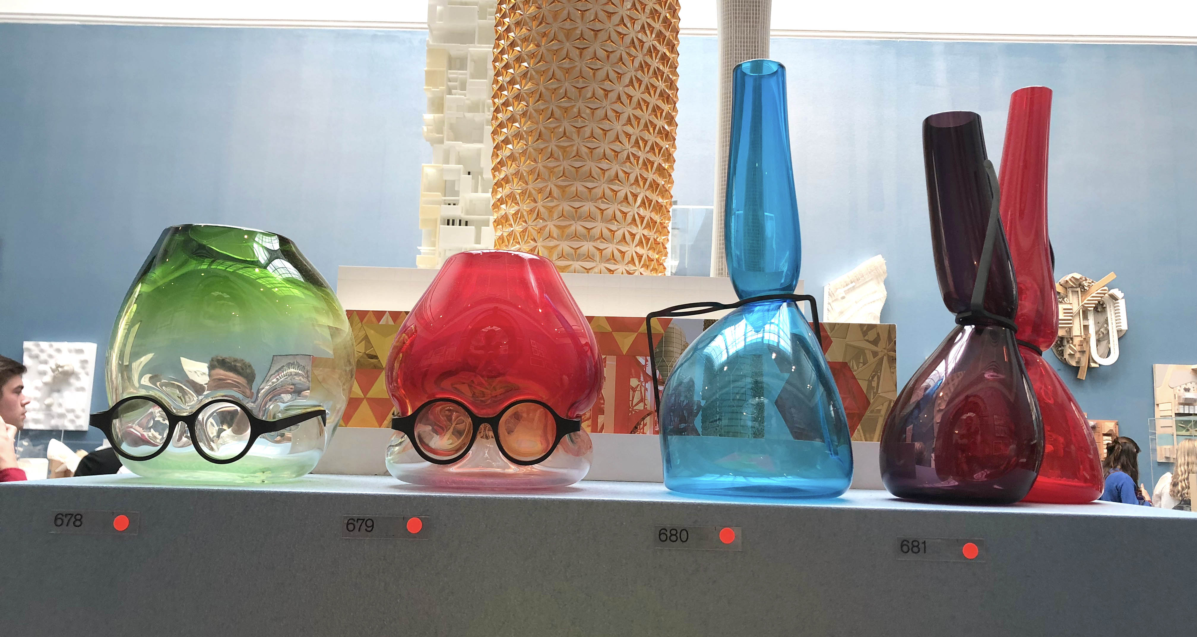
“Where are my glasses?” by Ron Arad RA
Gallery VII:
Gallery VII had a lot of sculptures in as the curator, Phyllida Barlow, chose to complement the previous architectural room with sculptural forms.

This particular piece “Lost in Thought” by Sir Tony Cragg RA reminded me of Henry Moore.
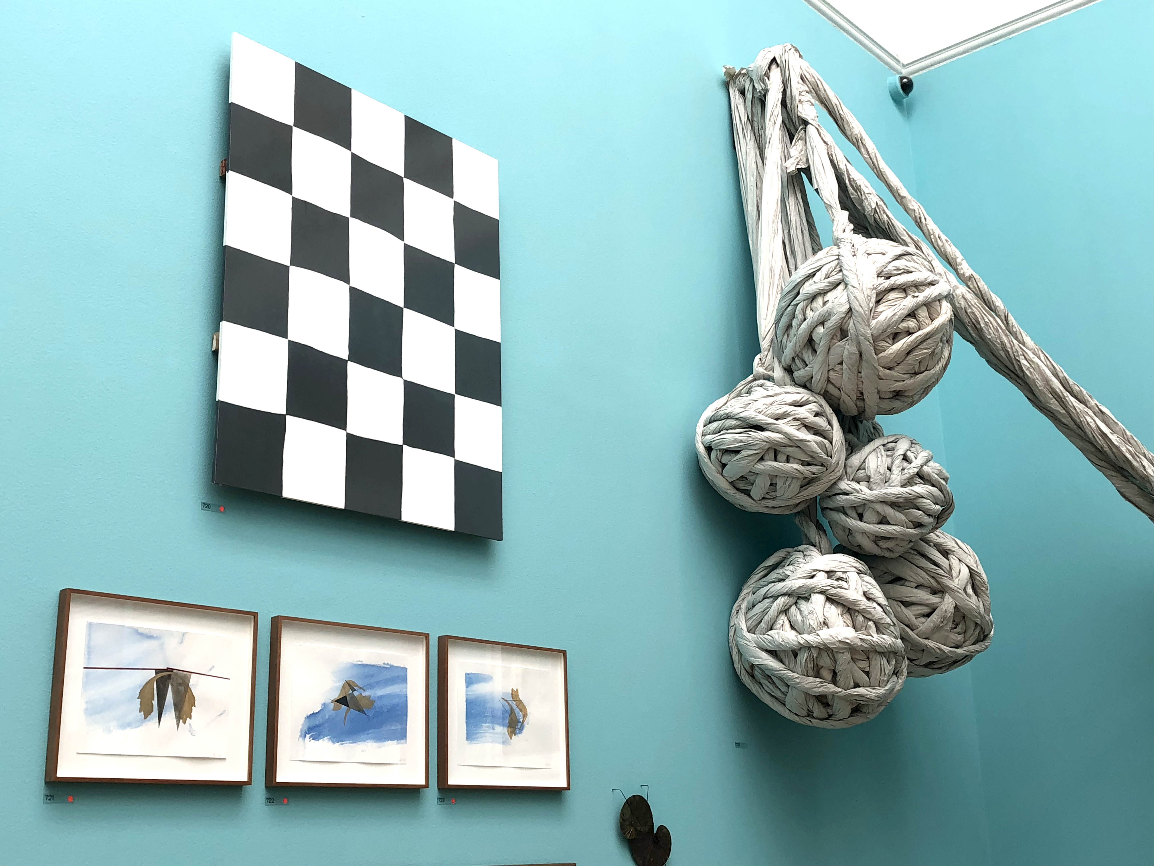
I can’t say that I full understand these hanging balls, but they sure make a statement. Balls by Cecile Johnson Soliz, £8,200.
If you saw my previous blog posts on the Summer Exhibition then you’ll know that time and time again, I come back to the wonderful Gillian Ayres – her pieces are always so colourful and bold!
Change in Fortune by El Anatsui Hon RA was definitely one of the highlights of the gallery for me. It’s one of the artworks that just drew you in no matter how far away you were standing.
I never really got to the bottom of this particular artwork by Lee Cutter, but I suspect that it has to do with artworks and expressionism in prisons, which I thought was an interesting idea that I’d never thought of before. The more you looked at this piece, the more intriguing it got…
Lee Cutter, Prison Culture, £4,500.
Here you can see them a bit closer…
Gallery VIII and Gallery IX:
Gallery VIII held one of the two hooked pieces in the exhibition, which was made with wool rather than rags. I think it was supposed to look like a PDF of a letter (or something like that) based on the name.
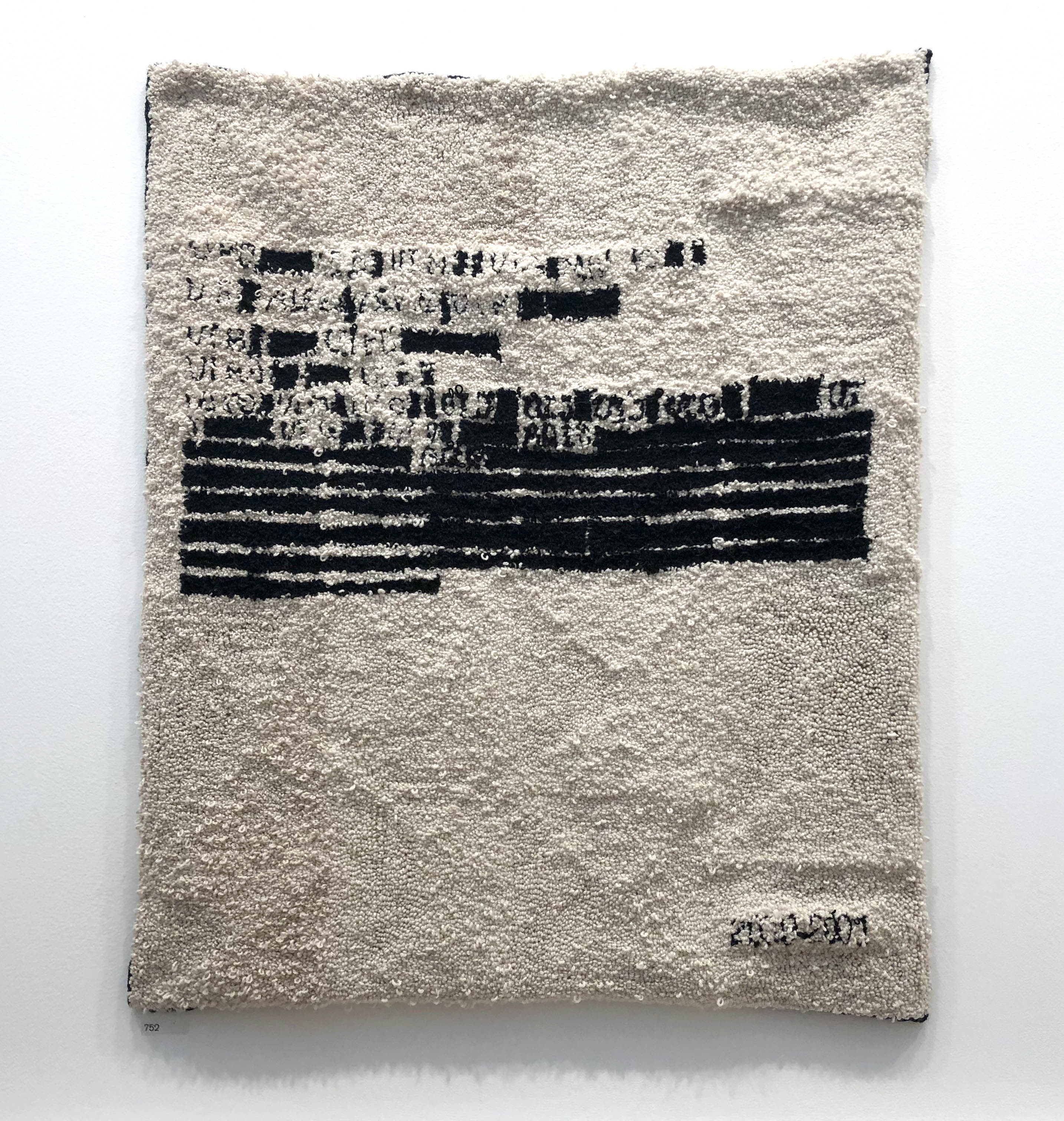
This hooked piece was called DOC_00000200901.PDF by Emily Lazerwitz. Oddly specific but it cost £2,009 and had statistics courtesy of the global terrorism database apparently…
Here you can see the hooking a bit closer up…
I immediately recognised this vase as being one of Grayon Perry’s works. I like how he uses classical shaped pots with modern topics. Hilarious name too “Stupid White Thing”.
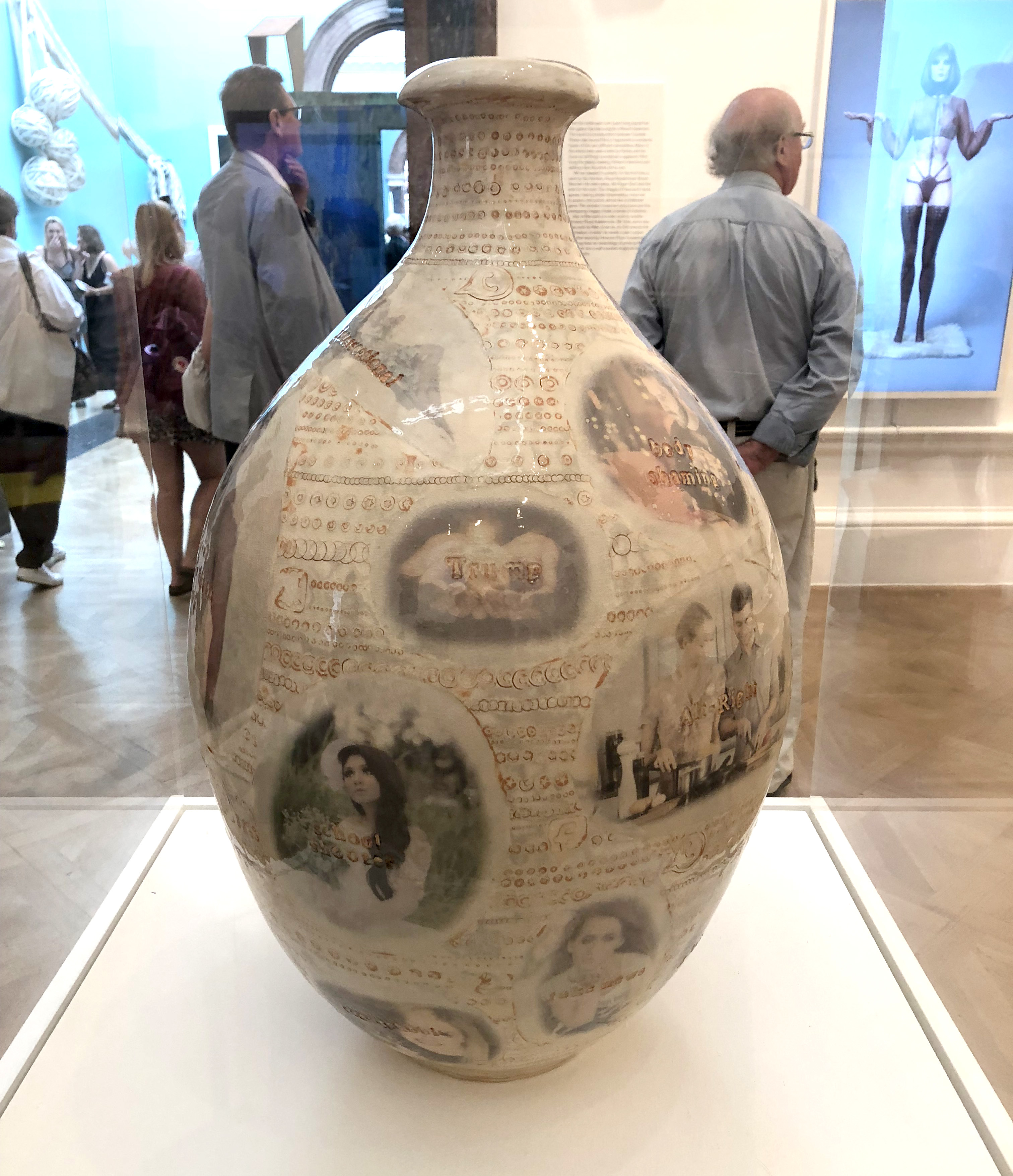
“Stupid White Thing” by Grayson Perry.
Generally I’m drawn to bright colours and bold shapes, but everyone needs a detox sometimes…
Constructive Interference by Tony Blackmore, £6000.
I think this particular piece is one of those “hmmm, what is art” pieces of art…
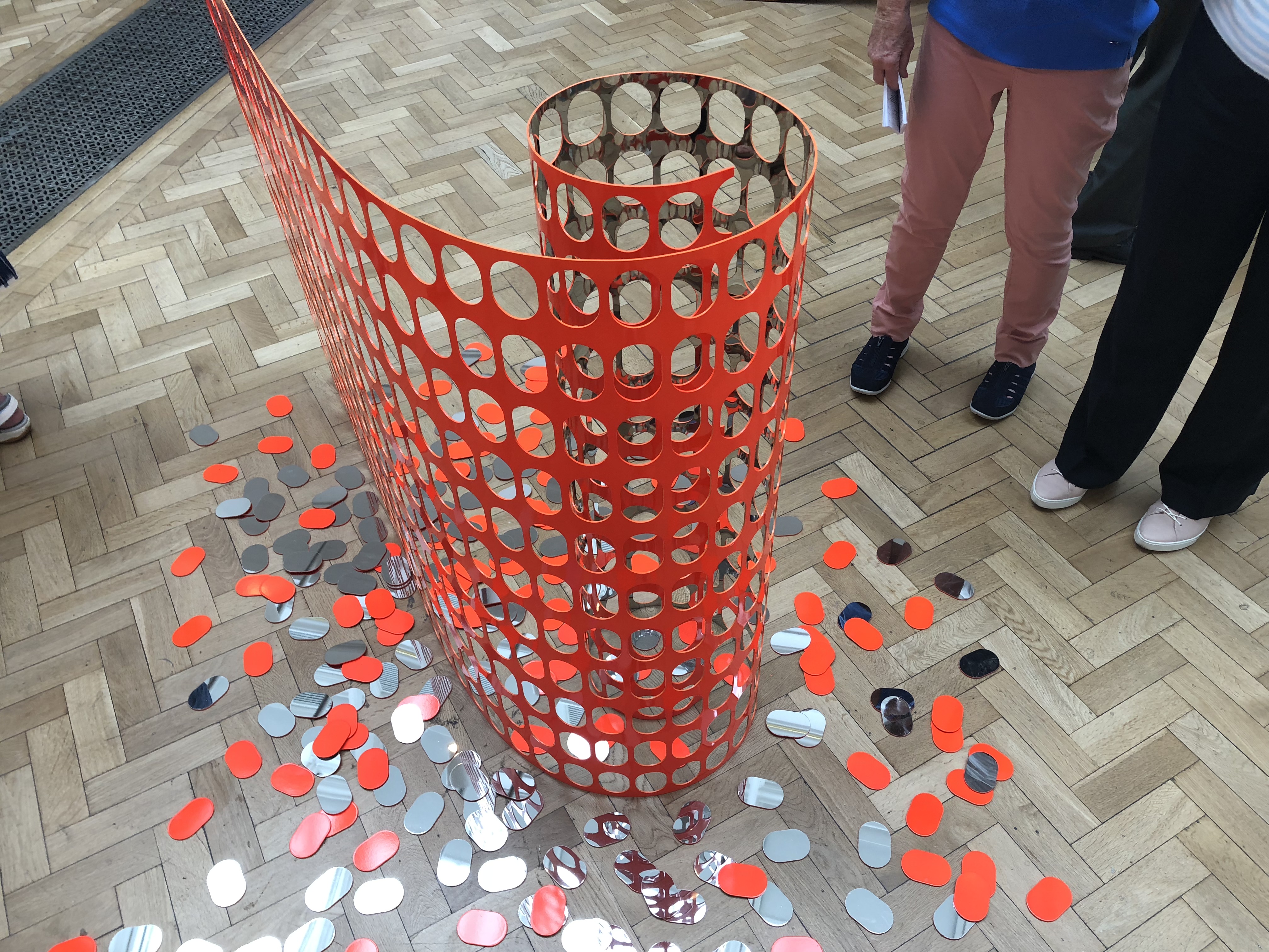
Temporary Fence by Graham Guy-Robinson is £12,000.
But it’s so shiny!!!
Even though it looks like a construction site, there was something oddly satisfying about the reflective pieces.
These fell into the bonkers, but brilliant category for me…
The Seven Stages of Degradation by Sophie Thomas and Louis Thomas, £9,750.
And who doesn’t like a good candle tower…
Vinculo de Dos by Ana Prada, £20,000.
Lecture Room:
One of the main galleries of the Summer Exhibition is the Lecture Room – it’s technically the last room in the show and who wouldn’t want to go out with a bang? The Lecture Room is normally full of big statement pieces and this year was no exception. One of the artists I particularly like last year was Bill Jacklin and this artwork of his was in pride of place the Lecture Room.
Singer in the Square by Bill Jacklin RA, £52,500.
This particular artwork reminded Kate and I of a delicious eton mess… maybe with a touch of mint… 🙂

Il Letto by Geoff Uglow, £18,000.
An artist who I come back to time and time again is John Wragg. His work is so deep and vibrant. I featured some of his gorgeous paintings in my highlights from last year and this year, I continued to be drawn to his work.
The Last Cigarette by John Wragg RA, £10,000.
I didn’t particularly like the artwork below, but I did like the colour combination of the yellow on the lilac wall.

Untitled by Mimmo Paladino Hon RA
I can’t even imagine how difficult it must be to curate something as diverse as the Royal Academy Summer Exhibition, but the below paintings are an example of what a great job the curators did. These were two different artists, but their work complemented each other so beautifully.
Left, “Night Follows Day” by Timothy Hyman. Right, “Bonnard Diary” by Leonard McComb
Once again, I’m a sucker for good colour combinations and the yellows and blues with touches of black, cream and red just worked for me…
Juliette and Juliette by David Remfry RA, £8,500.
I like bold artworks and “Slip Line” by John Carter RA really stood out in the room. £16,000.
Shooting Star by Bill Jacklin RA, £70,000.
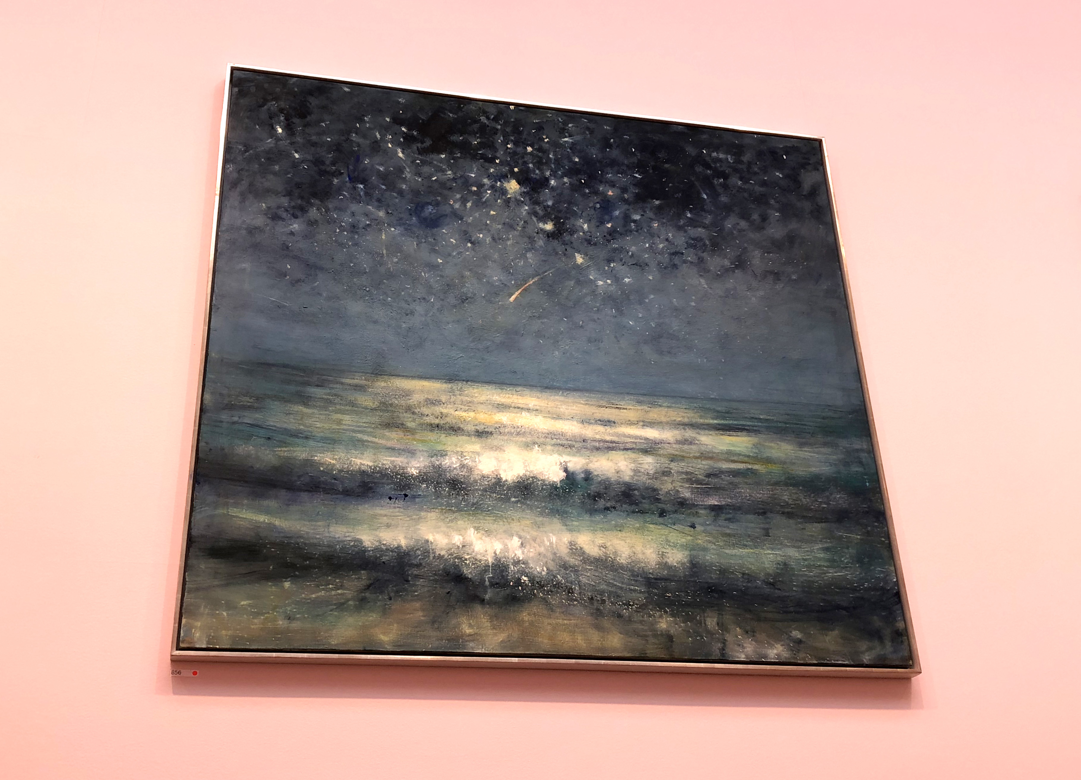
The Lecture Room was dominated by a couple of incredibly large artworks by David Hockney. This is only a small section of one of them, but you they were hard to miss.
“Inside it Opens up as Well” by David Hockney.
And then we were back round to where we started..
And here our mini tour ends I’m afraid. The first time I visited the 2018 show, I accidentally missed all the Sackler Galleries on the ground floor… ooops! I did wonder why it felt so much smaller than previous years, but it’s probably for the best that I did it in two bursts as it’s definitely a marathon rather than a sprint. Sooo, I don’t actually have any of my highlights from the Sackler Galleries in this post, but you can browse them here if you’re not too arted out.
Most importantly though, there’s still time to visit in person – my photos don’t do the artworks nearly the justice they deserve! The Royal Academy Summer Exhibition 2018 is on until 19th August, so head over to Green Park soon to not miss out on this delightful cornucopia of art 🙂
So what did you think?
As always, these are just a few of my highlights from the show (some that I actually like and some that I’m not quite so moved by). I’d really love to know which paintings you particularly liked. So, if you’ve visited the exhibition yourself or just browsed through my highlights above, which artworks stood out to you? Please comment below with which ones you loved (or maybe even hated!). xx
A Big Thanks:
Thanks to my friend and art partner in crime, Kate, for joining me at the exhibition this year and bearing with me while I moved through the exhibition at the speed of a snail 🙂 This kind and kick-ass lady is one of the best friends a girl could hope for and she better come back from Aus next year to go around the show with me again xx
Kate getting ready to get stuck into the exhibition…
CONNECT WITH US:
So, I’m arted out for the Summer now. I hope you found this brief introduction to the Summer Exhibition interesting and, if you’d like to be the first to hear about what else we get up to, why not join our Rag Rug Community on Facebook https://www.facebook.com/groups/RagRugCommunity/or join our fortnightly newsletter here.
OR CONNECT WITH US ON SOCIAL MEDIA AT:
Instagram: https://www.instagram.com/raggedlife/
Facebook: https://www.facebook.com/raggedliferagrugs/
Pinterest: https://www.pinterest.co.uk/raggedlife/
Twitter: https://twitter.com/raggedlife
As always, happy rag rugging!
Elspeth x
[…] 🙂 If you’re new to the Ragged Life Blog then you can see my highlights from the 2018 Show here and the 2017 Show […]
What an amazing show again this year. Everyone loved Between the Islands, the bright slightly Matisse one you showed at the beginning. I’ve been once to the show, must go again. Loved the Grayson Perry room with bright yellow background. I really like Anselm Kiefer but his wasn’t just out of my price range, it was not for sale!!
Completely agree Becky – Between the Islands was so so lovely! I think Grayson Perry did such a great job curating his room as it’s well known that Gallery III is one of the hardest spaces to bring together. I just looked up Anselm Kiefer – his work is very strong, but I think I must have missed it at the show. Do you know which galleries his pieces were in? There’s so much to see! Did you like the Sackler Galleries? Elspeth x
Love the dog on a unicycle!
Hahaha, me too Cronster. Who doesn’t like a good bit of art with humour in it 😉